Things Michael Thinks
Data science in learning, creating an interactive presentation with jupyter notebook and plotly.
Let’s say you have performed some analysis using Jupyter notebook and produced some great visualisations to back up your finding. How would you present this to your stakeholders and other people? One great way to ace this is to convert your jupyter notebook and plotly graphs to an interactive presentation that can impress people.

Introduction
I learned on creating slides using Jupyter Notebook from Tahsin Mayeesha’s medium post . However, I was curious to see if I can incorporate interactive graphs from Plotly in the slides. Therefore, I wrote this post to share what I’ve learned.
For this post, I will use the Titanic dataset from Kaggle . This dataset is a classic dataset used to learn machine learning models on classification problems.
In this case, my aim was to present my finding from an Exploratory Data Analysis on the Titanic dataset. I would include several visualisations and slides to show what you can do with Jupyter markdown and slides. Although I would use Plotly mostly for the slides, I have also included one plot with Seaborn and one plot from Pandas Profiling library to show the possibilities you can do.
For my presentation, I imported the following visualisation libraries.
- Plotly, including the Plotly Express and Plotly Graph Objects
- Pandas Profiling visualisation for missing values in the dataframe.
All the libraries above are not required to make the slides work, you can just simply use Plotly , Seaborn , or even simply Matplotlib . You can check the full notebook on my GitHub repo here .
Jupyter Notebook Slideshow View and Setting

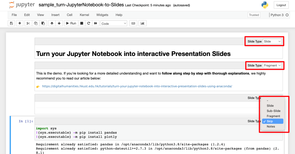
Changing the view will allow you to set what type of slides you want for each cell. There are 5 Slide Types you can select:
- Slide . This is the main content of a slide. You can place markdown, visuals, or even code here.
- Sub-Slide . I will consider this as a new slide with transition animation. You have to use the down arrow navigation to access it from the main slide (Slide type).
- Fragment . This will be a part or component of the immediate previous cell with Slide Type. For example, one cell with the heading will be set as Slide and the visualisation will be set as Fragment. The fragment will be inside the main slide but with a fade-in transition.
- Skip . This cell will not be shown on the slides. Perfect for code and comment cells that you won’t show. Be aware that you can’t put skip for your visualisation code because the output will not be shown as well.
- Notes . This will create Speaker notes, but I haven’t tried this function. From the NbConvert reference , you need to have a local copy of the Reveal.JS file to allow you having a presenter view with the notes.
Skip type for Non-Visualisation Code Cell

Slide type for Title and Markdown Cell
For the first slide or the cover, I will only use one markdown cell with title, subtitle, and author.

Slide + Fragment types for Mixture of Markdown and Code Cells

Hiding the Codes on the Slide

Specific for Plotly
If you use plotly, then you need to pay attention in this section. Otherwise, your plotly graphs won’t show up in the slides.
Plotly will require its JavaScript file ( plotly.js ) to produce the graph. There are three options you can choose:
- A local copy of JavaScript file. This is the easiest and simplest way to ensure the Plotly graphs to work. You can download the latest JS file from this link and rename it into plotly.js. This file needs to be in the same folder or directory with the resulting HTML slides file.
- Refer to CDN online. This is a great option if you want a lightweight HTML file and have constant access to the Internet. This is perfect if you want to embed the slides on a website. To do this, create a new code cell at the beginning, include this code here: from IPython.display import Javascript Javascript ( """require.config({ paths: { plotly: 'https://cdn.plot.ly/plotly-latest.min' } });""" )
The get_plotlyjs function would return the whole minified Plotly JS script and by using the Javascript function from IPython we include this in the notebook. The resulting file would be 3MB larger because of the inclusion. However, you will only have one HTML file that you can just send or use anytime.
Converting the Notebook to Slides
To produce the slides from the jupyter notebook, run the following code on your command prompt or bash:
Here we are calling nbconvert function that can be used to convert the notebook into slides (HTML format with Reveal.js) or other formats as can be referred on the documentation .
The TagRemovePreprocessor will remove any code with to_remove tag as we specified. Again, this can be replaced with any other tag you specified before hand.
If you check your directory, the html version of your notebook will be there. You can open this on the web browser and use the directional pad on the screen or arrow keys on your keyboard to navigate. I was able to open the file and interact with Plotly graphs successfully using Chrome, Firefox, Opera, and Microsoft Edge. I heard this might not work so well with Safari but I can’t confirm this.
For me personally, I found that using --post serve , I could not terminate the server using Ctrl-C as described even after many tries. However, I also found that I can omit this in my command prompt and still get the HTML slides file.
Final Output of the Slides
Here are the following slides I produced from my jupyter notebook that you can find on GitHub
- Alumni & Careers
- News & Events
Turn your Jupyter Notebook into interactive Presentation Slides using Anaconda
Table of contents, download our sample and try it yourself, 1. open powershell prompt in anaconda, 2. change directory to current folder, 3. type jupyter nbconvert command, 1. enable slideshow view, explanation of each “slide type”, 3. add tag to hide code of charts on the slide, next article – host html file online.
In our “Learn Python From Zero For Absolute Beginner” series , you have learnt how to use Python to do some data manipulation tasks and create interactive charts using Plotly within Jupyter Notebook. After completing your analysis, it is common that you will need to deliver a presentation to present your findings. Traditionally, this might involve manually capturing screenshots of your notebook’s code and charts, and creating static slides using PowerPoint or Canva for your presentation. However, there is a more time-saving and dynamic approach, allowing you to convert your Jupyter Notebook into interactive slides . You can showcase your code , visualizations, and insights while retaining the interactivity of the Plotly charts you created. Give a try to this approach and captivate your audience with an interactive presentation experience derived directly from your Jupyter Notebook! At the end of this article, you will be able to convert your Jupyter Notebook (.ipynb file) to one single HTML file . By double clicking the HTML file, you can view your Jupyter Notebook content as below in the browser:
Before we proceed with configuring the settings in Anaconda to transform cells into slides, let’s first walk through the straightforward process of converting an .ipynb file to an HTML file .
To help you grasp the speed and simplicity of this conversion, please download our sample Jupyter Notebook (.ipynb file) here and follow the steps outlined below.
You may find the content in this .ipynb file familiar if you have been following our “Learn Python From Zero For Absolute Beginners” series as we have taken code snippets from the first two lessons and compiled them into this .ipynb file.

Convert ipynb file to HTML file

If you need guidance on how to install or use Anaconda, you can refer to our previous article here .
If you are a Mac user, you have the advantage of utilizing the Terminal directly on your Mac for the subsequent steps.

- Windows user: Powershell Prompt in Anaconda
- Mac user: Terminal in Mac
In the Powershell Prompt window or Terminal, use the cd command to change directory to the folder that you stored the .ipynb file.
Method 1: Using command below
Method 2: Drag and drop
Drag and drop the folder where storing the .ipynb file to the Powershell Prompt window or Terminal after typing cd .
Type the command below in the Powershell Prompt window. You may change sample.ipynb to the filename of your .ipynb file. This command uses nbconvert tool to convert an .ipynb notebook file into various static formats like HTML.
If you are using Terminal in Mac, you may need to execute the following command before executing the jupyter nbconvert command.
After executing the jupyter nbconvert command, an HTML file will be automatically generated in the current folder ( sample.slides.html in this case). The generated HTML file retains the content and structure of the ipynb Notebook, now conveniently presented in a slide format. One notable advantage is that the generated HTML file has a relatively small file size, which is beneficial for sharing and transferring files.
If you have a good understanding of HTML, you can further customize the generated HTML file, making modifications to the styling or content of the slides.

Configure settings in Jupyter Notebook to transform cells into slides
Before proceeding with the conversion process to HTML as outlined above, you need to make some configurations in Jupyter Notebook using Anaconda .
This configuration allows you to selectively choose which cells to display , ensuring that only the relevant content appears in the HTML output, showcasing the most important code snippets, explanations, and visualizations. This flexibility empowers you to tailor the HTML slides to your specific needs and deliver a concise and impactful presentation to your audience.
In the menu bar, click “ View ” → “ Cell Toolbar ” → “ Slideshow “.
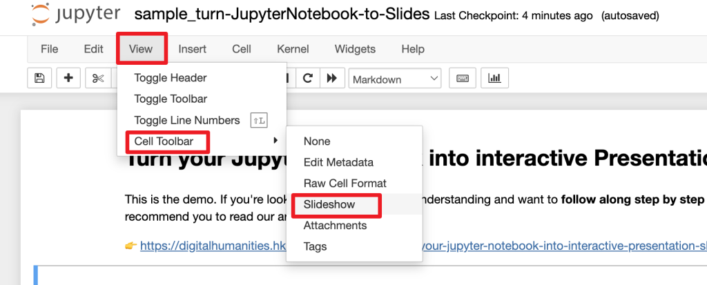
2. Select Slide Type for each cell
After enabling the slideshow view, you can now select the “Slide Type” of each cell at the top right hand corner.
| Type | Explanation | |
|---|---|---|
| Slide | a main slide | |
| Sub-Slide | a sub-slide which will be shown when using the down arrow navigation (▼) | |
| Fragment | the cell content will be inside the main slide with a fade-in transition | |
| Skip | the cell content will not be displayed in the presentation slide | |
| Notes | speaker notes for the slide, the cell content will not be displayed in the presentation slide |
If you prefer showcasing charts or visualizations on the slides without including the corresponding code, you can assign specific tags to the desired cells.
In the menu bar, click “ View ” → “ Cell Toolbar ” → “ Tags “.
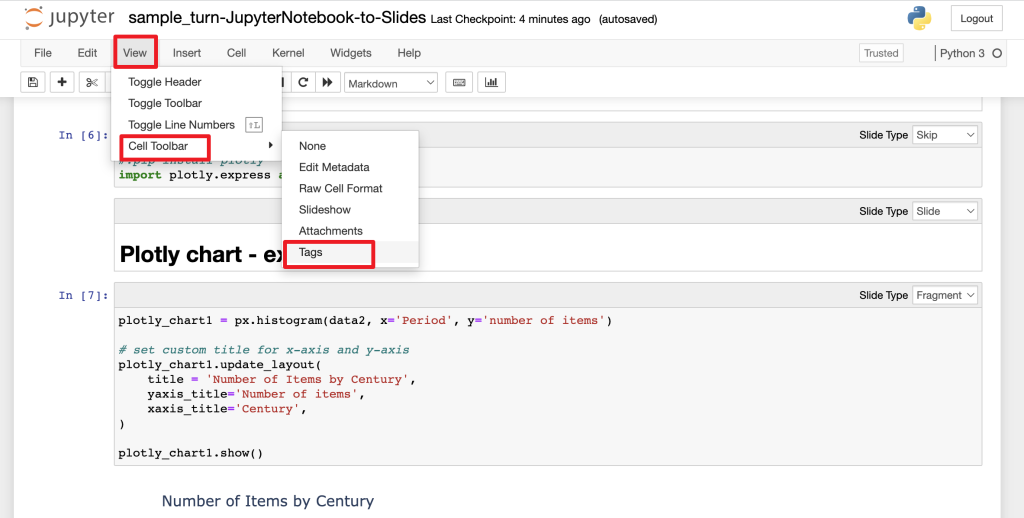
Type to_remove in the top right hand corner of the cell, and click “ Add tag “.

After configured each cell in Jupyter Notebook using Anaconda, you can now follow the steps in the previous section “Convert ipynb file to HTML file” to turn your Jupyter Notebook into interactive HTML Presentation Slides. The generated output is a single HTML file, making it incredibly convenient to share and save on a USB drive. Simply double-click on the HTML file to open it in any web browser. This portability and accessibility make it ideal for presenting in a classroom setting too. Good luck on your presentation!
As the converted file is in HTML format, you can also choose to host it as a website online like below. In our upcoming article, we will guide you through the process of hosting your HTML file on GitHub Pages. Stay tuned!
Kam, M. (2020, June 28). Creating an interactive presentation with Jupyter Notebook and Plotly. Things Michael Thinks. https://www.michaelkam.id/data-visualisation/2020/06/28/creating-an-interactive-presentation-with-jupyter-notebook-and-plotly.html
Krishnamurthy, D. (2015, December 5). Jupyter Notebook, Reveal.js and Github Pages. kdheepak. https://kdheepak.com/blog/jupyter-notebook-revealjs-and-github-pages
Mayeesha, T. (2018, February 12). Present your data science projects with Jupyter Notebook slides! Medium. https://medium.com/learning-machine-learning/present-your-data-science-projects-with-jupyter-slides-75f20735eb0f
– By Holly Chan , Library
October 6, 2023
You may also be interested in…

How to host your website on GitHub Page
Learn python from zero for absolute beginner (2): data visualization.

How to open .ipynb file (Jupyter Notebook)
Comprehensive Guide to Visualizing Data in Jupyter
Learn how to create charts using Matplotlib, Plotly, and Seaborn

Jupyter empowers data scientists to perform interactive data visualization seamlessly with the help of cells , each cell contains the business logic (code chunk) that you want to test or visualize. It supports programming languages like Python and R and also enables visualizations, and explanatory text as markdowns in a single interface. This capability enhances the visualizations by enabling dynamic data exploration.
Three of the most frequently used Python libraries for data visualization are Matplotlib , Plotly , and Seaborn that you will further explore in this article.
In this article, you will learn data visualization by performing Exploratory Data Visualization on the House Credit Default Risk Dataset.
Getting Started with Data Visualization in Jupyter
For this article, we will use the House Sales Dataset from Kaggle. You can see how to get started with Jupyter in our Exploring Data in Jupyter with Python and Pandas article
Installing and Importing Matplotlib, Plotly, and Seaborn
Once you are up and running with Jupyter, you need to install the necessary libraries for reading the data and visualization. You can use PIP to install these requirements as follows:
The above command will install all the required libraries into your environment:
Pandas is an open-source data manipulation and analysis library for Python. It provides data structures like Series and DataFrame to handle and analyze structured data seamlessly. Its powerful and flexible tools make it a top choice for data preprocessing, cleaning, and exploratory data analysis.
Matplotlib is a fundamental plotting library for Python that provides a wide array of static, animated, and interactive visualizations. It is known for its versatility, allowing users to generate plots, histograms, power spectra, bar charts, error charts, scatterplots, and more with just a few lines of code.
Seaborn is a statistical data visualization library based on Matplotlib. It offers a higher-level interface, with themes and visualizations tailored for statistical analysis. Seaborn simplifies the process of producing attractive visualizations and works well with pandas DataFrame structures.
Plotly is an interactive graphing library for Python (as well as for R, JavaScript, and more). It enables the creation of visually appealing web-based interactive plots and dashboards. Plotly's visualizations are rendered using a web browser, allowing for intricate interactivity, and can be easily integrated into web applications or shared online.
Now import these libraries into Jupyter Notebook by typing the below code in the notebook cell.
The as keyword creates the alias for these libraries. It reduces the typing effort and makes the code look clean. You can now run the cell by clicking on the Run button on the panel or by pressing the Shift+Enter keys together.
Now load the dataset into the notebook using pandas:

Note: You don’t need to use print statement for the last line variable in Jupyter cell, just mention the name and jupyter will print it automatically.
Exploring Data with Matplotlib
Matplotlib is a very basic yet features-rich visualization library that provides you with options to create different plots and charts including line plots , distribution plots , bar charts , scatter plots and advanced viz like geographical heat maps . It is the Ur visualization library in Python—everything comes from Matplotlib.
Creating a Simple Line Plot Using Matplotlib
To create a simple line plot, you can use the plot() method from matplotlib. You can create a plot with either X-axis values and Y-axis values, or just the X-axis alone. This graph is widely used to establish a relationship between two or more variables. A simple line plot for 100 house prices from the dataset can be plotted as follows:

You can customize this graph further with markers, colors, x labels, y labels, titles, and so on as matplotlib supports all these functionalities.

To learn more about line plots in matplotlib you can check out the official docs .
Scatter Plots for Visualizing Relationships and Patterns
You can create a scatter plot using matplotlib’s scatter() method. This plots different scatter points between the Y-axis and X-axis. These plots identify the relationship, correlation, and trend between two variables. A simple scatter plot between floors and price features from house data can be plotted as follows:

The above figure depicts the correlation between two numeric variables, the number of floors and house price.
Bar Plots and Histograms for Categorical and Numerical data
Line plots and scatter plots are limited to the numerical data, so if you want to visualize categorical data, bar plots are where it’s at. You can use the bar() method from matplotlib to represent the categorical data. Let’s plot a bar graph for house sales prices per city.

Seattle is expensive. The first line of the code, figsize() lets you control the canvas where the plot is represented, you can adjust the size of that canvas based on your requirements. To learn more about bar graphs, check out this link .
A similar graph that represents quantitative is a histogram. This type of graph helps you identify the frequency distribution in the data and can be plotted with the hist() method from the matplotlib:

The bin argument in the hist() method represents the intervals in the graph, the higher the bins lower the intervals. To learn more about the histograms, check out this link .
Creating Subplots and Multi-axis Visualizations
If you are creating visualizations for analysis or reporting, sometimes you need to create multiple plots together to visualize and compare different categories. Subplots helps you define a grid of plots (in rows and columns) and lets you create graphs in these grids. To do so you need to use the subplot() method from the matplotlib to create the grid (m X n) and then using a multi-axis plot you can create the subplots:

This creates a subplot with 1 row and 2 columns, and then using the axs object you can create any type of graph you within each subplot.
Mapping and Geographical Visualization Using Matplotlib
Working with geographical data can be hard if done with the visualization tools like Tableau. In Python, you can visualize the geospatial data (comprised of Longitude and latitude) with the help of matplotlib along with an extension called cartopy . You can install it using the following command:
To create a simple geographical plot, let’s start with importing the necessary libraries and creating sample data.
Next, write the following code to generate a simple geoplot of this data:

In the above code, We imported cartopy.crs from the Cartopy library to specify the map projection ccrs.PlateCarree() for our plot. Then we created a figure and axis with the specified projection using subplot_kw={'projection': ccrs.PlateCarree()} . We added map features (land and coastlines) to the axis using ax.add_feature() . This creates a map background. When plotting city markers, we added transform=ccrs.PlateCarree() to ensure that the longitude and latitude coordinates are properly transformed to the chosen projection. To know the details of cartopy and how it helps in creating geoplots, you can read their official page .
Interactive Visualizations with Plotly
Plotly is a versatile and powerful data visualization library that empowers users to create interactive graphs, charts, and dashboards . Plotly is user-friendly and can transform complex datasets into engaging visual narratives.
Creating Interactive Line and Scatter Plots
The Plotly Express library ( plotly.express ) can create interactive line and scatter plots. For this, it uses the line() method to create an interactive line plot while the scatter() method to create an interactive scatter plot. A simple line chart for house prices can be created as follows:

The line method of Plotly is very similar to Matplotlib’s line method the only difference is that it generates interactive plots i.e. if you hover over the graphs, the data points will be shown.
To create a scatter plot is as simple:

These line and scatter plots will be interactive allowing you to zoom in, hover over data points for more information, and interact with the plot in various ways. Check out more details about plotly line plots and about scatter plots .
Building Bar Charts and Histograms with Interactivity
To create a bar chart using plotly and a Pandas DataFrame, you can pass the DataFrame name, X values column, and Y values column to the bar() method. You can also choose different color schemes and labels for the data based on your requirements.

Similar to matplotlib, plotly provides the histogram() method to check the data distribution of different columns and provides additional functions to interact with the graphs.

As you can see the histogram visualization provides the lasso select option to crop a specific region from the plot as part of the user interactivity. Check out more details about histograms on the official plotly page .
Advanced 3D Plots in Plotly
Creating 3D plots and surface plots using Plotly is a powerful way to visualize data in three dimensions. These types of plots are particularly useful when you’re dealing with data that has multiple variables and you want to explore the relationships. Here’s an example of how to create 3D plots using Plotly in Python:

In this example, we use the plotly.graph_objects module to create a 3D scatter plot. We first generate random x and y values, and then calculate a corresponding z value using a simple equation. The go.Scatter3d() method is used to create the 3D scatter plot with the x, y, and z data. The mode parameter is set to markers to indicate that we want markers for each data point. Then We create a layout using go.Layout and set a title for the plot. The go.Figure() method combines the data and layout to create the plot.
Incorporating Plotly Maps and Geographical Visualizations
Plotly provides a convenient way to create interactive geographical visualizations, including choropleth maps, scatter plots on maps, and more. Here’s an example of how to incorporate Plotly maps and geographical visualizations in Python:

For the choropleth map, We define sample data with countries and corresponding values. The px.choropleth() function creates a choropleth map. We provide the data frame, specify the locations and location mode, set the color based on the Value column, and set the title. Finally, the plot is shown using the show() method. To learn more about different types of maps and plots with plotly, you can refer to this page .
Stylish Visualizations with Seaborn
Seaborn , a popular data visualization library built on top of Matplotlib, and is known for its aesthetic capabilities that simplify the process of creating great-looking plots.
By offering beautiful default styles, versatile color palettes, easy customization options, statistical visualizations, facet grids, and more, Seaborn helps analysts craft professional-quality visuals that effectively communicate insights and patterns within their data.
Creating Visually Appealing Scatter and Line Plots with Seaborn
To create a simple scatter plot between the house price and number of floors, you can use this code:

In the above code, we set the Seaborn style using the set(style='whitegrid') method to enhance the aesthetics of the plots. The we use scatterplot() method to create a scatter plot by providing x and y columns from the DataFrame, and we set the color and label for the plot. We customize the title and add a legend using regular Matplotlib functions, this is it. Check the official page of seaborn to know more about scatter plots.
Similarly, you can use the lineplot() method to create customized line plots with seaborn.

Check out more on customizing the line plots with Seaborn here .
Using Seaborn for Statistical Data Visualization
You can also customize different distribution plots such as KDE Plots or histograms with Seaborn. For example, you can create both a histogram and a KDE plot in the same figure by calling both histplot() and kdeplot() methods.

Pair Plots and Heatmap Visualizations for Correlation Analysis
With a pair plot, each numerical variable in the data is shared across the y-axes in a single row and the x-axes in a single column. This helps you to check the pairwise relationship in the data. To create a pairplot, use the pairplot() method and pass your dataframe to it and it will generate a graph for all numerical columns.

You can see that there is a huge plot created that represents the relationship of each variable with others.
Another great option for exploring the relation among different columns in the dataset is a heatmap. This plot shows the correlation among different variables in the dataset and can be plotted using the heatmap() method of Seabron.

In the above code, we first calculated the correlation of variables using the corr() method and then plotted the heatmap with the heatmap() method by passing the correlation matrix. To know more customization options for seaborn, check this official page .
Best Practices for Effective Data Visualization
Choosing the right visualization for your data and message.
Selecting an appropriate visualization is crucial for drawing insights from data. Consider the nature of your data (categorical, numerical, time-series ), the relationships you want to highlight, and the message you intend to communicate.
For Example, Bar charts are ideal for comparing categorical data, while line charts show trends over time. Scatter plots reveal correlations and pie charts represent parts of a whole. Understand your data’s characteristics and the story you want to tell to make an informed choice. Avoid overloading visualizations with unnecessary details; clarity and relevance are key.
Design Principles for Clear and Impactful Visualizations
Designing clear visualizations involves adhering to principles like simplicity, consistency, and hierarchy. Minimize clutter by removing non-essential elements. Use a consistent color scheme and labeling across visuals for ease of interpretation. Establish a clear visual hierarchy, emphasizing the most important information. Appropriate font sizes, contrast, and alignment improve readability. Applying Gestalt principles like proximity, similarity, and continuity helps viewers perceive patterns effortlessly.
Optimizing Visualizations for Presentation and Publication
Optimizing visualizations for different contexts enhances their impact. For presentations, prioritize clarity and simplicity, using minimal text and emphasizing visuals. Ensure labels, legends, and titles are readable even from a distance.
On the other hand, for publications, include more details and context, possibly adding annotations or supplemental explanations. Pay attention to color choices, as some colors may not translate well in print. Tailor the visual’s resolution and format to the medium, considering the specifics of projectors, screens, or printing.
Handling Large Datasets and Performance Considerations
Visualizing large datasets requires strategies to prevent overwhelming visuals and slow rendering. Aggregating data or using sampling techniques can provide a more manageable view without sacrificing insights. Interactive elements, such as zooming and filtering, enable users to explore details dynamically.
Choose appropriate chart types; for instance, heatmaps can represent dense data effectively. Implement efficient coding practices and consider using libraries optimized for large datasets, like plotly. Regularly test performance to ensure a smooth user experience.
Sharing Jupyter Notebooks with Interactive Visualizations
Jupyter notebooks allow the sharing of data analysis along with interactive visualizations. Leverage libraries like Plotly, Bokeh , or mpld3 to create dynamic plots directly within notebooks. When sharing notebooks, consider the audience’s technical familiarity and the tools they use to view notebooks (Jupyter, GitHub ). Use clear explanations, headings, and markdown cells to guide readers through the analysis. Ensure dependencies and libraries are well-documented, and code cells are organized. Consider exporting notebooks to various formats (HTML, PDF) for wider accessibility, enabling non-technical stakeholders to benefit from your insights.
Seeing More With Jupyter Visualization
Matplotlib, Plotly, and Seaborn each offer unique advantages in data visualization within Jupyter notebooks. Matplotlib provides extensive customization, Plotly focuses on interactivity, and Seaborn simplifies aesthetically pleasing statistical visualizations. The choice of library depends on the specific needs of the analysis and the desired level of interactivity and customization.
Visualizing data opens doors to new perspectives on your data and allows you to tell more compelling stories. As with any storytelling medium, the best visualizations are those that resonate with viewers, providing clarity and insight, and guiding them towards data-driven decisions or understandings.
Want to learn more about Jupyter notebooks?
Here are some of our other articles:
Accessing Data in Jupyter with Python
Exploring data in jupyter with python and pandas.
How to Share Jupyter Notebooks?
What is the Jupyter kernel, and how does it work?
More on further reading.

Complete guide on how to use Python with Jupyter to access the most popular data sources and set up the first step of your data analysis pipeline.

A detailed guide to data exploration in Jupyter with Python and Pandas. See how to clean, preprocess, and deduplicate data. Learn how to use statistics and visualization to find insights and outliers.

How to Share Jupyter Notebooks
Learn how to share Jupyter notebooks with technical and non-technical audiences.

Learn how the computational engine for notebooks functions.

Notebooks weren't built for the modern data stack
Our tools for exploration and analysis are living in the past.

Modernizing Jupyter workflows with Hex + Snowflake
A supercharged, collaborative, cloud-native way to notebook
Create interactive slides with Python in 8 Jupyter Notebook cells
Creating presentations in Jupyter Notebook is a great alternative to manually updating slides in other presentation creation software. If your data changes, you just re-execute the cell and slide chart is updated.
Jupyter Notebook is using Reveal.js (opens in a new tab) for creating slides from cells. The standard approach is to write slides code and Markdown in the Jupyter Notebook. When notebook is ready, it can be exported to standalone HTML file with presentation.
What if, you would like to update slides during the slide show? What is more, it would be fantastic to have interactive widgets in the presentation. You can do this in Mercury framework.
In this tutorial, we will create an interactive presentation in Jupyter Notebook and serve it with Mercury.
Create presentation in notebook
Please enable Slideshow toolbar in Jupyter Notebook. It can be done by clicking View -> Cell Toolbar -> Slideshow . It is presented in the screenshot below:

We will need following packages to create presentation in Python notebook:
Please make sure that they are installed in your environment.
1. Import packages and App setup
The first step is to import packages and setup Mercury App :
We setup title and description for App object.
Please note that we set Slide Type to Skip . This cell will not appear in the presentation.
2. Add title
The second cell is a Markdown with title:
The Slide Type is set to Slide . It is our first slide!
3. Add slide with Markdown
Add new Markdown cell with the following cell.
Please set Slide Type to Slide . It will be a second slide. I'm using ## as slide title ( # will produce too large title in my opinion).
4. Add Mercury Widget
Please add code cell with Text widget. We will use it, to ask users about their name.
We set Slide Type as Skip , so this cell will not appear in the presentation.
5. Display name
Let's use the name.value in the slide. Please add a code cell. We will display a Markdown text with Python variables by using Markdown function from Mercury package.
Please set the Slide Type to Slide .
You can display Markdown with Python variables by calling mr.Markdown() or mr.Md() functions. Both do the same.
The first five cells of the notebook:

You can enter your name in the widget during the notebook development. There will be no change in other cells. If you want to update the cell with new widget value, please execute it manually.
6. More widgets
We can add more widgets to the presentation. They will be used to control chart in the next slide.
We have used Slider and Select widgets. They are displayed in the notebook. This cell will not be displayed in the presentation, so set Slide Type to Skip .
7. Scatter plot
We will add a new code cell. It will have Slide Type set to Slide .
We used widgets values by accessing them with samples.value and color.value .
Screenshot of the notebook with scatter plot:

8. Final slide
Please add a last Markdown cell. Its Slide Type will be set to Slide :
Please notice that link is added with HTML syntax. There is a target="_blank" used to open link in a new tab.
Run presentation in Mercury
Please run Mercury local server in the same directory as notebook:
The above command will open a web browser at http://127.0.0.1:8000 . Please click on a card with presentation.
You can navigate between slides with arrows in the bottom right corner. You can enter the full screen mode by pressing F on the keyboard. Please use Esc to exit full screen mode.
You can change widgets values in the sidebar and presentation slides will be automatically recomputed:
You can export your slides as PDF or HTML by clicking Download button in the sidebar.
Ben's Corner
Jupyter notebooks with plotly, install anaconda python, create the conda environment, activate the environment, run the notebook, write the notebook.
Plotly is my current favorite Python graphing library. Here's how to use it with Jupyter Notebooks
Install from the website . If it gives you the option to add Python to the PATH, I suggest you take it.
Create a local environment . Local environments don't clutter your system install with libraries you might not want later and are easy to create and delete.
This installs the Jupyter notebook interface and plotly. It can take a while to run, so be patient.
conda activate and conda deactivate only work on conda 4.6 and later versions. For conda versions prior to 4.6, run:
- Windows: activate or deactivate
- Linux and macOS: source activate or source deactivate
I have an older version of conda and I'm on Linux, so I use source activate hello_plotly
This opens up a Jupyter notebook in your browser (usually at http://localhost:8888/tree ).
- Create the Python notebook with the "Python 3" interpreter

- Verify that you're using the correct Python:

- Import Plotly and initialize offline notebook mode
- Plot something!
Here's a screenshot of my complete notebook for reference.

- presentation
Create Presentation from Jupyter Notebook

You don't need to install any additional framework to make a presentation from Jupyter Notebook. Jupyter is using Reveal.js library for creating slides. However, I strongly recommend to install RISE ( R eveal.js I Python S lideshow E xtension) extension. It greatly simplifies the process of slide creation with a live preview.
The outline for this article:
- create a simple notebook with one chart,
- convert notebook to a slideshow,
- presentation development with RISE extension,
- parameterized presentations,
- publishing presentation.
Create Jupyter Notebook
Let's create a Jupyter notebook. It will have a few Markdown and Python cells.

Please notice that we can mix Python variables with Markdown thanks to IPython.display.Markdown() function:
The output of the above code cell will contain a Markdown. There is a simple scatter plot in the notebook for randomly generated points:
The matplotlib scatter plot:

It is a simple notebook created for example purposes. There is no limit on the number of slides or cells. From my experience, I was creating a presentation with more than 70 slides with many plots/images, and the slideshow was working smoothly, even with the presentation published as a website (hosted in the cloud).
Create Presentation
The notebook is saved in ipynb format . The next step is to convert it to a slideshow. We need to provide information on how to use cells in the presentation. Please click View ➡️ Cell Toolbar ➡️ Slideshow .

Each cell will have a toolbar with the select widget. You can select there how cells will be used in the presentation:
- Slide - the cell will be a new slide;
- Sub-Slide - the cell will be shown in the current slide as a replacement for previous content. It will be available in arrow-down navigation;
- Fragment - the cell will appear in the current slide, it will append to the previous content. It will be available in arrow-down and arrow-right navigation;
- Skip - the content will not be displayed in the presentation;
- Notes - notes for slide, the cell content is not displayed in the presentation;
Please select the Slide Type for every cell and save the notebook.

How to create a presentation for Jupyter Notebook? We need to use the nbconvert tool. It is installed with Jupyter Notebook. There is a command for converting notebook to presentation:
You can open the output file presentation.slides.html in the web browser (just double-click on the file). Alternatively, you can serve slides with jupyter ; slides will be available at http://127.0.0.1:8000/presentation.slides.html :
There are several ways to hide the code in the presentation, one of them is to pass --no-input parameter to nbconvert :
The presentation with hidden code:
It is possible to convert the Jupyter Notebook presentation into PDF slides. One of the ways to do this is to add ?print-pdf in the URL in a web browser while displaying HTML format:
The presentation will be in a format ready to print. To save it as a PDF, just print the website with Save as PDF selected for the destination.

RISE Extension
There is a RISE extension that may be helpful for developing presentations in Jupyter Notebook. It can be easily installed with pip or conda :
You get a small chart icon in the top toolbar after installation. You switch between the notebook and presentation views by clicking on the chart icon.
What is more, you can edit the code in presentation mode. The RISE extension doesn't have the option to hide the code ( GitHub issue discussion about hiding code feature in RISE repository ). If you would like to hide/show the code during the presentation development, you need to install an additional extension called hide_code .
Parameterized Presentation
What if you would like to change or recompute charts in the presentation based on user input? There is an open-source framework called Mercury that makes it possible.
You can easily add interactive widgets to the presentation and publish it with Mercury . Widgets are added based on the YAML header. They are directly connected with Python variables in the notebook. User changes, tweak widgets, and execute the notebook with new values. The slides in the presentation will be automatically recomputed.
The video from an interactive presentation about Mercury :
Publishing Presentation
The final presentation is in HTML format. You can publish it as a static website. There are several ways to publish Jupyter Notebook; you can host it on GitHub Pages, Netlify, or Vercel. If you are using Mercury framework for parameterized presentations, you can host it in the cloud (soon, there will be available online service runmercury.com for hosting notebooks).
Jupyter Notebook Presentations might be a great alternative to traditional presentation software. You will save time by building the presentation in the same environment where your code is. Any update in code or chart change will immediately affect the presentation - no need to manually copy-paste results. The parameterized presentation can take your slides one step further. Imagine your supervisor or manager playing with your slides and recomputing new charts.
Secure Your Spot in Our Statistical Methods in R Online Course Starting on September 9 (Click for More Info)
Python plotly Graph Using Jupyter Notebook (Example)
Hi! This tutorial will demonstrate how to use the Python plotly library inside Jupyter Notebook .
Here is an overview:
Let’s get right into it!
What is Jupyter Notebook?
Jupyter Notebook is an open-source web application that allows you to create and share documents that contain live code, equations, visualizations, and narrative text. It’s particularly popular among data scientists and researchers for its ability to combine code execution, text, mathematical equations, and visualizations all in one document.
The key features of Jupyter Notebook include:
- Support for Multiple Programming Languages: Though it originated as a tool for Python, Jupyter now supports various programming languages including R , Julia , and Scala .
- Interactive Computing: You can write and execute code in real-time within the notebook, allowing for interactive data exploration and analysis.
- Rich Output Formats: Jupyter can display various types of output including HTML, images, videos, LaTeX, and more, making it suitable for generating reports, presentations, and academic papers.
- Integration with Data Visualization Libraries: Jupyter works seamlessly with popular data visualization libraries like Matplotlib , seaborn , and plotly , enabling users to create compelling visualizations alongside their analysis.
- Shareability: Notebooks can be easily shared with others, either as static documents or as interactive web applications, making collaboration and reproducibility easier.
Install & Launch Jupyter Notebook
To install and launch Jupyter Notebook, run the following lines of code in your terminal or command line:
After running jupyter notebook , it will start the local server and, if all goes well, you should see an interface that looks like this open up in your browser:

Click on New , then select Notebook . It will launch a new untitled Notebook where you will be prompted to select a Kernel. If not selected by default, select the Python 3 (ipykernel) option and click Select .
Sometimes, you may need to upgrade your version of pip before you can properly install Jupyter Notebook on your computer. If you are using a PC, open your command prompt or terminal as an administrator by right-clicking on it and selecting Run as administrator . Then upgrade pip by running python -m pip install --upgrade pip .
Next, install Jupyter Notebook by running python -m pip install jupyter , and then launch the Notebook with jupyter notebook . You should see the same interface as above open up in your browser.
Another option for installing and launching Jupyter Notebook is to use the Anaconda distribution of the Notebook. Anaconda is an open-source software, which distributes Jupyter Notebook, Spyder, RStudio , and other IDEs.
You will first need to download and install the Anaconda navigator. When that is done, you can then install Jupyter Notebook by clicking the Install button. Next, launch the Notebook by clicking the Launch button. You will now have the local Jupyter Notebook server running on your computer.
Install & Import plotly
With Jupyter Notebook installed and launched, we can now install and import plotly. To do so, run the lines of code below:
Now that we have installed and imported plotly into the Python programming environment of our Jupyter Notebook, we can now build interactive visualizations. First, we have to create the example dataset.
Create Example Dataset
We will use the tips dataset that comes preloaded in plotly as our example dataset. To load and preview the first 10 rows of the dataset, run the lines of code below:
With the example dataset loaded and previewed, we can now build visualizations.
Example: Build Interactive Box Plot
We will build a simple box plot visualizing the tipping habits of male and female diners on different days of the week.
Run the lines of code below to build the box plot:
In the above example, we needed to first import plotly.io as pio and then set pio.renderers.default = "iframe" before we built the box plot. This is necessary because in Jupyter Notebook, plotly visualizations are not automatically displayed.
This seems to be a drawback for using plotly in Jupyter Notebook. Nevertheless, the above solution works well, and enables plotly graphs to be displayed inside the Notebook. You can find other similar recommendations here .
Having set the visualization to display inside the Notebook, we then used the px.box() method to build the box plot wherein we passed the DataFrame df , and defined the x-axis as the sex column; the y-axis as the tip column, and then grouped the box plots by day . Lastly, we displayed the plot using fig.show() .
You can build and display other interactive plotly visualizations inside your Jupyter Notebook as well.
Video, Further Resources & Summary
Do you need more explanations on how to use Python plotly library inside Jupyter Notebook? Then you should have a look at the following YouTube video of the Statistics Globe YouTube channel.
In the video, we explain in some more detail how to use Python plotly library inside Jupyter Notebook.
The YouTube video will be added soon.
With that, we have demonstrated how to use Python plotly library inside Jupyter Notebook. Furthermore, you could have a look at some of the other interesting plotly in Python tutorials on Statistics Globe, starting with these:
- plotly Bubble Chart in Python (3 Examples)
- plotly Candlestick Chart in Python (3 Examples)
- plotly Treemap in Python (3 Examples)
- plotly Table in Python (4 Examples)
- plotly Sunburst Chart in Python (4 Examples)
- Introduction to Python Programming
This post has shown how to use Python plotly library inside Jupyter Notebook . I hope you found it helpful! In case you have further questions, you may leave a comment below.

This page was created in collaboration with Ifeanyi Idiaye. You might check out Ifeanyi’s personal author page to read more about his academic background and the other articles he has written for the Statistics Globe website.
Subscribe to the Statistics Globe Newsletter
Get regular updates on the latest tutorials, offers & news at Statistics Globe. I hate spam & you may opt out anytime: Privacy Policy .
Leave a Reply Cancel reply
Your email address will not be published. Required fields are marked *
Post Comment

I’m Joachim Schork. On this website, I provide statistics tutorials as well as code in Python and R programming.
Statistics Globe Newsletter
Get regular updates on the latest tutorials, offers & news at Statistics Globe. I hate spam & you may opt out anytime: Privacy Policy .
Related Tutorials

Customize Legend of plotly Graph in Python (Barplot Example)
You are using an outdated browser. Please upgrade your browser to improve your experience.
Getting Started with Plotly in Python
Getting Started with Plotly for Python.
Plotly is a free and open-source graphing library for Python. We recommend you read our Getting Started guide for the latest installation or upgrade instructions, then move on to our Plotly Fundamentals tutorials or dive straight in to some Basic Charts tutorials .
Overview 
The plotly Python library is an interactive, open-source plotting library that supports over 40 unique chart types covering a wide range of statistical, financial, geographic, scientific, and 3-dimensional use-cases.
Built on top of the Plotly JavaScript library ( plotly.js ), plotly enables Python users to create beautiful interactive web-based visualizations that can be displayed in Jupyter notebooks, saved to standalone HTML files, or served as part of pure Python-built web applications using Dash. The plotly Python library is sometimes referred to as "plotly.py" to differentiate it from the JavaScript library.
Thanks to deep integration with our Kaleido image export utility, plotly also provides great support for non-web contexts including desktop editors (e.g. QtConsole, Spyder, PyCharm) and static document publishing (e.g. exporting notebooks to PDF with high-quality vector images).
This Getting Started guide explains how to install plotly and related optional pages. Once you've installed, you can use our documentation in three main ways:
- You jump right in to examples of how to make basic charts , statistical charts , scientific charts , financial charts , maps , and 3-dimensional charts .
- If you prefer to learn about the fundamentals of the library first, you can read about the structure of figures , how to create and update figures , how to display figures , how to theme figures with templates , how to export figures to various formats and about Plotly Express, the high-level API for doing all of the above.
- You can check out our exhaustive reference guides: the Python API reference or the Figure Reference
For information on using Python to build web applications containing plotly figures, see the Dash User Guide .
We also encourage you to join the Plotly Community Forum if you want help with anything related to plotly .
Installation 
plotly may be installed using pip :
This package contains everything you need to write figures to standalone HTML files.
Note: No internet connection, account, or payment is required to use plotly.py. Prior to version 4, this library could operate in either an "online" or "offline" mode. The documentation tended to emphasize the online mode, where graphs get published to the Chart Studio web service. In version 4, all "online" functionality was removed from the plotly package and is now available as the separate, optional, chart-studio package (See below). plotly.py version 4 is "offline" only, and does not include any functionality for uploading figures or data to cloud services.
Plotly charts in Dash 
Dash is the best way to build analytical apps in Python using Plotly figures. To run the app below, run pip install dash , click "Download" to get the code and run python app.py .
Get started with the official Dash docs and learn how to effortlessly style & deploy apps like this with Dash Enterprise .
Sign up for Dash Club → Free cheat sheets plus updates from Chris Parmer and Adam Schroeder delivered to your inbox every two months. Includes tips and tricks, community apps, and deep dives into the Dash architecture. Join now .
JupyterLab Support 
To use plotly in JupyterLab , install the jupyterlab and ipywidgets packages in the same environment as you installed plotly , using pip :
The plotly jupyterlab extension is included when you install plotly using pip or conda . When you run Jupyter Lab, ensure you are running it in the same environment that you installed plotly in so it has access to the plotly jupyterlab extension.
JupyterLab 2 or earlier does not support the prebuilt extensions installed using pip and conda . If you are using JupyterLab 2, run the following command to install the required JupyterLab extensions (note that this will require node to be installed):
Launch JupyterLab with:
and display plotly figures inline using the plotly_mimetype renderer...
or using FigureWidget objects.
See Displaying Figures in Python for more information on the renderers framework, and see Plotly FigureWidget Overview for more information on using FigureWidget .
See the Troubleshooting guide if you run into any problems with JupyterLab, particularly if you are using multiple Python environments inside Jupyter.
Jupyter Notebook Support 
For use in the classic Jupyter Notebook , install the notebook and ipywidgets packages using pip :
These packages contain everything you need to run a Jupyter notebook...
and display plotly figures inline using the notebook renderer...
Static Image Export 
plotly.py supports static image export , using the either the kaleido package (recommended, supported as of plotly version 4.9) or the orca command line utility (legacy as of plotly version 4.9).
Kaleido 
The kaleido package has no dependencies and can be installed using pip...
Orca 
While Kaleido is now the recommended image export approach because it is easier to install and more widely compatible, static image export can also be supported by the legacy orca command line utility and the psutil Python package.
These dependencies can both be installed using conda:
Or, psutil can be installed using pip...
and orca can be installed according to the instructions in the orca README .
Extended Geo Support 
Some plotly.py features rely on fairly large geographic shape files. The county choropleth figure factory is one such example. These shape files are distributed as a separate plotly-geo package. This package can be installed using pip...
See USA County Choropleth Maps in Python for more information on the county choropleth figure factory.
Chart Studio Support 
The chart-studio package can be used to upload plotly figures to Plotly's Chart Studio Cloud or On-Prem services. This package can be installed using pip...
Note: This package is optional, and if it is not installed it is not possible for figures to be uploaded to the Chart Studio cloud service.
Where to next? 
Once you've installed, you can use our documentation in three main ways:
What About Dash? 
Dash is an open-source framework for building analytical applications, with no Javascript required, and it is tightly integrated with the Plotly graphing library.
Learn about how to install Dash at https://dash.plot.ly/installation .
Everywhere in this page that you see fig.show() , you can display the same figure in a Dash application by passing it to the figure argument of the Graph component from the built-in dash_core_components package like this:

- Stack Overflow for Teams Where developers & technologists share private knowledge with coworkers
- Advertising & Talent Reach devs & technologists worldwide about your product, service or employer brand
- OverflowAI GenAI features for Teams
- OverflowAPI Train & fine-tune LLMs
- Labs The future of collective knowledge sharing
- About the company Visit the blog
Collectives™ on Stack Overflow
Find centralized, trusted content and collaborate around the technologies you use most.
Q&A for work
Connect and share knowledge within a single location that is structured and easy to search.
Get early access and see previews of new features.
Showing plotly on jupyter notebook
I have a dataframe 'country' that I am plotting using jupyter notebook.
It plotted nicely on Kaggle's notebook, but refuses to show when I use jupyter notebook..
I've read similar problems on StackOverflow, and I've tried both :
Please find the full code below:

- jupyter-notebook
- Are you getting an error message? – Josmoor98 Commented Apr 28, 2018 at 8:46
I tried using your code, replacing your data with some of Plotly's example data. I'm not able to replicate the issue you're having. Assuming you have correctly installed plotly using $ pip install plotly and there are no issues with the data, the following should work.
from plotly.offline import iplot isn't necessary, since you use py.iplot .
- 1 Thank you for this! I had a Jupyter notebook with plotly images that loaded in past using the fig.show() command. However, this is no longer working reproducibly and was able to fix the issue with two statements from above: import plotly.offline as py and py.init_notebook_mode(connected=True) – veg2020 Commented Aug 12, 2020 at 13:42
- Glad it helped! – Josmoor98 Commented Aug 12, 2020 at 13:45
Your Answer
Reminder: Answers generated by artificial intelligence tools are not allowed on Stack Overflow. Learn more
Sign up or log in
Post as a guest.
Required, but never shown
By clicking “Post Your Answer”, you agree to our terms of service and acknowledge you have read our privacy policy .
Not the answer you're looking for? Browse other questions tagged python jupyter-notebook plotly or ask your own question .
- The Overflow Blog
- The world’s largest open-source business has plans for enhancing LLMs
- Featured on Meta
- User activation: Learnings and opportunities
- Site maintenance - Mon, Sept 16 2024, 21:00 UTC to Tue, Sept 17 2024, 2:00...
- What does a new user need in a homepage experience on Stack Overflow?
- Announcing the new Staging Ground Reviewer Stats Widget
Hot Network Questions
- \luastring variant that expands tokens once if they are a cs
- Generalization of the Schur-Zassenhaus Theorem
- What was the newest chess piece
- How do I pin the calculator to my home screen?
- Would Dicyanoacetylene Make a Good Flamethrower Fuel?
- Young adult fantasy book about a girl who accidentally kills her boyfriend and decides to attend an academy for witches or magic
- Rich Mental Images
- My math professor is Chinese. Is it okay for me to speak Chinese to her in office hours?
- HTA w/ VBScript to open and copy links
- Is `std::map<std::string, int>` faster than `std::map<std::string_view, int>`?
- how does the US justice system combat rights violations that happen when bad practices are given a new name to avoid old rulings?
- Fifth year PhD student with no progress on my thesis because of advisor, what to do?
- Movie from the fifties where aliens look human but wear sunglasses to hide that they have no irises (color) in their eyes - only whites!
- Is it possible/recommended to paint the side of piano's keys?
- Can noun phrase have only one word?
- What ever happened to combinatorial chemistry? (Super hyped in the 90s.)
- How to prove this problem about ternary quadratic form?
- Is Sagittarius A* smaller than we might expect given the mass of the Milky Way?
- Why did the Chinese government call its actual languages 'dialects'? Is this to prevent any subnational separatism?
- Are Backstabs All That Bad?
- Not great at regexs. Trying to code-golf this beast of a regex WITHOUT using string replacement (for G-Zip purposes)
- Bounded Star Height and corresponding fragments of MSO
- '05 Scion tC, bought used. 145 k, unknown if spark plugs were ever changed. Should I change 'em?
- Build exterior cabin walls using plywood siding
IMAGES
VIDEO
COMMENTS
To upload the presentation online pass it through py.presentation_ops.upload(). In your string, use --- on a single line to seperate two slides. To put a title in your slide, put a line that starts with any number of # s. Only your first title will be appear in your slide. A title looks like: Anything that comes after the title will be put as ...
One great way to ace this is to convert your jupyter notebook and plotly graphs to an interactive presentation that can impress people. Introduction. I learned on creating slides using Jupyter Notebook from Tahsin Mayeesha's medium post. However, I was curious to see if I can incorporate interactive graphs from Plotly in the slides.
import plotly.plotly as py import plotly.presentation_objs as pres filename = 'pres-with-images' markdown_string = """ # Animals of the Wild---# The Lion Panthera leo is one of the big cats in the Felidae family and a member of genus Panthera. It has been listed as Vulnerable on the IUCN Red List since 1996, as populations in African range countries declined by about 43 % s ince the early 1990s.
In our "Learn Python From Zero For Absolute Beginner" series, you have learnt how to use Python to do some data manipulation tasks and create interactive charts using Plotly within Jupyter Notebook.After completing your analysis, it is common that you will need to deliver a presentation to present your findings. Traditionally, this might involve manually capturing screenshots of your ...
Plotting Inline. You can use Plotly's python API to plot inside your Jupyter Notebook by calling plotly.plotly.iplot() or plotly.offline.iplot() if working offline. Plotting in the notebook gives you the advantage of keeping your data analysis and plots in one place. Now we can do a bit of interactive plotting.
Now that I've got my slides, there's one final step. In order to open this notebook as a slideshow I need to run a command in Terminal: jupyter nbconvert Jupyter\ Slides.ipynb --to slides ...
Now import these libraries into Jupyter Notebook by typing the below code in the notebook cell. import pandas as pd import numpy as np import matplotlib.pyplot as plt import seaborn as sns import plotly. The as keyword creates the alias for these libraries. It reduces the typing effort and makes the code look clean.
Creating presentations in Jupyter Notebook is a great alternative to manually updating slides in other presentation creation software. If your data changes, you just re-execute the cell and slide chart is updated. Jupyter Notebook is using Reveal.js (opens in a new tab) for creating slides from cells. The standard approach is to write slides ...
Plotly is another interactive plotting library that provides a high-level API for visualization. See the Plotly JupyterLab documentation to get started with Plotly in the notebook. Plotly uses renderers to output different kinds of information when you display a plot. Experiment with renderers to get the output you want.
This installs the Jupyter notebook interface and plotly. It can take a while to run, so be patient. conda create-n hello_plotly python=3 nb_conda plotly Activate the environment conda activate hello_plotly conda activate and conda deactivate only work on conda 4.6 and later versions. For conda versions prior to 4.6, run: Windows: activate or ...
We will first import all the dependencies that we will be using in this example. We will then load the data and convert the format of the "date" column into date time. Then we will create the ...
You can create a presentation directly from Jupyter Notebook. The presentation slides can be constructed from single, multi-code or Markdown cells. The cell's code can be hidden in the presentation (to not scare nontechnical viewers). The final slides can be shared as a website or converted to a PDF file.
Goal 1: upload my pyplot chart to char studio, so I can later share the public link with colleagues through emails, embed the chart into a sharepoint intranet or embed it into a ppt presentation for quarterly review. Goal 2: save my pyplot chart locally as html & either share or embed the interactive chart into a sharepoint intranet or embed it ...
Rich Output Formats: Jupyter can display various types of output including HTML, images, videos, LaTeX, and more, making it suitable for generating reports, presentations, and academic papers. Integration with Data Visualization Libraries: Jupyter works seamlessly with popular data visualization libraries like Matplotlib , seaborn , and plotly ...
Launching the application. Let's start creating our dashboard. First, we launch the Dash application: app = Dash(__name__) Next, we create a layout; for now, it is just an empty DIV container.
Installation. There are a few ways to use a Jupyter Notebook: Install with pip. Open a terminal and type: $ pip install jupyter. Windows users can install with setuptools. Anaconda and Enthought allow you to download a desktop version of Jupyter Notebook. nteract allows users to work in a notebook enviornment via a desktop application.
The plotly jupyterlab extension is included when you install plotly using pip or conda.When you run Jupyter Lab, ensure you are running it in the same environment that you installed plotly in so it has access to the plotly jupyterlab extension.. JupyterLab 2 or earlier does not support the prebuilt extensions installed using pip and conda.If you are using JupyterLab 2, run the following ...
What is Plotly? It's an interactive Python graphing library. You can make many beautiful and engaging charts using Plotly, such as line plots, scatter plots, box plots, histograms, and heatmaps…
I'm running plotly=5.9.0 in jupyter-notebook=6.5.2 through my DataSpell IDE. Although currently functional as of 20 April, 2023, many of the historical solutions for rendering Plotly graphics in Jupyter Notebooks are deprecated according to this post-> (see my comments below). The final solution that worked for me:
Official documentation page says: For use in the classic Jupyter Notebook, install the notebook and ipywidgets packages using pip... $ pip install "notebook>=5.3" "ipywidgets>=7.2". or conda. $ conda install "notebook>=5.3" "ipywidgets>=7.2". These packages contain everything you need to run a Jupyter notebook... $ jupyter notebook.
It plotted nicely on Kaggle's notebook, but refuses to show when I use jupyter notebook.. I've read similar problems on StackOverflow, and I've tried both : init_notebook_mode(connected=True) &. py.offline.init_notebook_mode(connected=True) Please find the full code below: import plotly.offline as py. from plotly.offline import iplot.