Modern Data Science with R
3rd edition (light edits and updates)
Benjamin S. Baumer, Daniel T. Kaplan, and Nicholas J. Horton
July 25, 2024

3rd edition
This is the work-in-progress of the 3rd edition. At present, there are relatively modest changes from the second edition beyond those necessitated by changes in the R ecosystem.
Key changes include:
- Transition to Quarto from RMarkdown
- Transition from magrittr pipe ( %>% ) to base R pipe ( |> )
- Minor updates to specific examples (e.g., updating tables scraped from Wikipedia) and code (e.g., new group options within the dplyr package).
At the main website for the book , you will find other reviews, instructor resources, errata, and other information.
Do you see issues or have suggestions? To submit corrections, please visit our website’s public GitHub repository and file an issue.
Known issues with the 3rd edition
This is a work in progress. At present there are a number of known issues:
- nuclear reactors example ( 6.4.4 Example: Japanese nuclear reactors ) needs to be updated to account for Wikipedia changes
- Python code not yet implemented ( Chapter 21 Epilogue: Towards “big data” )
- Spark code not yet implemented ( Chapter 21 Epilogue: Towards “big data” )
- SQL output captions not working ( Chapter 15 Database querying using SQL )
- Open street map geocoding not yet implemented ( Chapter 18 Geospatial computations )
- ggmosaic() warnings ( Figure 3.19 )
- RMarkdown introduction ( Appendix Appendix D — Reproducible analysis and workflow ) not yet converted to Quarto examples
- issues with references in Appendix Appendix A — Packages used in the book
- Exercises not yet available (throughout)
- Links have not all been verified (help welcomed here!)
2nd edition
The online version of the 2nd edition of Modern Data Science with R is available. You can purchase the book from CRC Press or from Amazon .
The main website for the book includes more information, including reviews, instructor resources, and errata.
To submit corrections, please visit our website’s public GitHub repository and file an issue.

1st edition
The 1st edition may still be available for purchase. Although much of the material has been updated and improved, the general framework is the same ( reviews ).
© 2021 by Taylor & Francis Group, LLC . Except as permitted under U.S. copyright law, no part of this book may be reprinted, reproduced, transmitted, or utilized in any form by an electronic, mechanical, or other means, now known or hereafter invented, including photocopying, microfilming, and recording, or in any information storage or retrieval system, without written permission from the publishers.
Background and motivation
The increasing volume and sophistication of data poses new challenges for analysts, who need to be able to transform complex data sets to answer important statistical questions. A consensus report on data science for undergraduates ( National Academies of Science, Engineering, and Medicine 2018 ) noted that data science is revolutionizing science and the workplace. They defined a data scientist as “a knowledge worker who is principally occupied with analyzing complex and massive data resources.”
Michael I. Jordan has described data science as the marriage of computational thinking and inferential (statistical) thinking. Without the skills to be able to “wrangle” or “marshal” the increasingly rich and complex data that surround us, analysts will not be able to use these data to make better decisions.
Demand is strong for graduates with these skills. According to the company ratings site Glassdoor , “data scientist” was the best job in America every year from 2016–2019 ( Columbus 2019 ) .
New data technologies make it possible to extract data from more sources than ever before. Streamlined data processing libraries enable data scientists to express how to restructure those data into a form suitable for analysis. Database systems facilitate the storage and retrieval of ever-larger collections of data. State-of-the-art workflow tools foster well-documented and reproducible analysis. Modern statistical and machine learning methods allow the analyst to fit and assess models as well as to undertake supervised or unsupervised learning to glean information about the underlying real-world phenomena. Contemporary data science requires tight integration of these statistical, computing, data-related, and communication skills.
Intended audience
This book is intended for readers who want to develop the appropriate skills to tackle complex data science projects and “think with data” (as coined by Diane Lambert of Google). The desire to solve problems using data is at the heart of our approach.
We acknowledge that it is impossible to cover all these topics in any level of detail within a single book: Many of the chapters could productively form the basis for a course or series of courses. Instead, our goal is to lay a foundation for analysis of real-world data and to ensure that analysts see the power of statistics and data analysis. After reading this book, readers will have greatly expanded their skill set for working with these data, and should have a newfound confidence about their ability to learn new technologies on-the-fly.
This book was originally conceived to support a one-semester, 13-week undergraduate course in data science. We have found that the book will be useful for more advanced students in related disciplines, or analysts who want to bolster their data science skills. At the same time, Part I of the book is accessible to a general audience with no programming or statistics experience.
Key features of this book
Focus on case studies and extended examples.
We feature a series of complex, real-world extended case studies and examples from a broad range of application areas, including politics, transportation, sports, environmental science, public health, social media, and entertainment. These rich data sets require the use of sophisticated data extraction techniques, modern data visualization approaches, and refined computational approaches.
Context is king for such questions, and we have structured the book to foster the parallel developments of statistical thinking, data-related skills, and communication. Each chapter focuses on a different extended example with diverse applications, while exercises allow for the development and refinement of the skills learned in that chapter.
The book has three main sections plus supplementary appendices. Part I provides an introduction to data science, which includes an introduction to data visualization, a foundation for data management (or “wrangling”), and ethics. Part II extends key modeling notions from introductory statistics, including regression modeling, classification and prediction, statistical foundations, and simulation. Part III introduces more advanced topics, including interactive data visualization, SQL and relational databases, geospatial data, text mining, and network science.
We conclude with appendices that introduce the book’s R package, R and RStudio , key aspects of algorithmic thinking, reproducible analysis, a review of regression, and how to set up a local SQL database.
The book features extensive cross-referencing (given the inherent connections between topics and approaches).
Supporting materials
In addition to many examples and extended case studies, the book incorporates exercises at the end of each chapter along with supplementary exercises available online. Many of the exercises are quite open-ended, and are designed to allow students to explore their creativity in tackling data science questions. (A solutions manual for instructors is available from the publisher.)
The book website at https://mdsr-book.github.io/mdsr3e includes the table of contents, the full text of each chapter, and bibliography. The instructor’s website at https://mdsr-book.github.io/ contains code samples, supplementary exercises, additional activities, and a list of errata.
Changes in the second edition
Data science moves quickly. A lot has changed since we wrote the first edition. We have updated all chapters to account for many of these changes and to take advantage of state-of-the-art R packages.
First, the chapter on working with geospatial data has been expanded and split into two chapters. The first focuses on working with geospatial data, and the second focuses on geospatial computations. Both chapters now use the sf package and the new geom_sf() function in ggplot2 . These changes allow students to penetrate deeper into the world of geospatial data analysis.
Second, the chapter on tidy data has undergone significant revisions. A new section on list-columns has been added, and the section on iteration has been expanded into a full chapter. This new chapter makes consistent use of the functional programming style provided by the purrr package. These changes help students develop a habit of mind around scalability: if you are copying-and-pasting code more than twice, there is probably a more efficient way to do it.
Third, the chapter on supervised learning has been split into two chapters and updated to use the tidymodels suite of packages. The first chapter now covers model evaluation in generality, while the second introduces several models. The tidymodels ecosystem provides a consistent syntax for fitting, interpreting, and evaluating a wide variety of machine learning models, all in a manner that is consistent with the tidyverse . These changes significantly reduce the cognitive overhead of the code in this chapter.
The content of several other chapters has undergone more minor—but nonetheless substantive—revisions. All of the code in the book has been revised to adhere more closely to the tidyverse syntax and style. Exercises and solutions from the first edition have been revised, and new exercises have been added. The code from each chapter is now available on the book website. The book has been ported to bookdown , so that a full version can be found online at https://mdsr-book.github.io/mdsr2e .
Key role of technology
While many tools can be used effectively to undertake data science, and the technologies to undertake analyses are quickly changing, R and Python have emerged as two powerful and extensible environments. While it is important for data scientists to be able to use multiple technologies for their analyses, we have chosen to focus on the use of R and RStudio (an open source integrated development environment created by Posit) to avoid cognitive overload. We describe a powerful and coherent set of tools that can be introduced within the confines of a single semester and that provide a foundation for data wrangling and exploration.
We take full advantage of the ( RStudio ) environment. This powerful and easy-to-use front end adds innumerable features to R including package support, code-completion, integrated help, a debugger, and other coding tools. In our experience, the use of ( RStudio ) dramatically increases the productivity of R users, and by tightly integrating reproducible analysis tools, helps avoid error-prone “cut-and-paste” workflows. Our students and colleagues find ( RStudio ) to be an accessible interface. No prior knowledge or experience with R or ( RStudio ) is required: we include an introduction within the Appendix.
As noted earlier, we have comprehensively integrated many substantial improvements in the tidyverse , an opinionated set of packages that provide a more consistent interface to R ( Wickham 2023 ) . Many of the design decisions embedded in the tidyverse packages address issues that have traditionally complicated the use of R for data analysis. These decisions allow novice users to make headway more quickly and develop good habits.
We used a reproducible analysis system ( knitr ) to generate the example code and output in this book. Code extracted from these files is provided on the book’s website. We provide a detailed discussion of the philosophy and use of these systems. In particular, we feel that the knitr and rmarkdown packages for R , which are tightly integrated with Posit’s ( RStudio ) IDE, should become a part of every R user’s toolbox. We can’t imagine working on a project without them (and we’ve incorporated reproducibility into all of our courses).
Modern data science is a team sport. To be able to fully engage, analysts must be able to pose a question, seek out data to address it, ingest this into a computing environment, model and explore, then communicate results. This is an iterative process that requires a blend of statistics and computing skills.
How to use this book
The material from this book has supported several courses to date at Amherst, Smith, and Macalester Colleges, as well as many others around the world. From our personal experience, this includes an intermediate course in data science (in 2013 and 2014 at Smith College and since 2017 at Amherst College), an introductory course in data science (since 2016 at Smith), and a capstone course in advanced data analysis (multiple years at Amherst).
The introductory data science course at Smith has no prerequisites and includes the following subset of material:
- Data Visualization: three weeks, covering Chapters 1 Prologue: Why data science? – 3 A grammar for graphics
- Data Wrangling: five weeks, covering Chapters 4 Data wrangling on one table – 7 Iteration
- Ethics: one week, covering Chapter 8 Data science ethics
- Database Querying: two weeks, covering Chapter 15 Database querying using SQL
- Geospatial Data: two weeks, covering Chapter 17 Working with geospatial data and part of Chapter 18 Geospatial computations
A intermediate course at Amherst followed the approach of Baumer ( 2015 ) with a pre-requisite of some statistics and some computer science and an integrated final project. The course generally covers the following chapters:
- Data Visualization: two weeks, covering Chapters 1 Prologue: Why data science? – 3 A grammar for graphics and 14 Dynamic and customized data graphics
- Data Wrangling: four weeks, covering Chapters 4 Data wrangling on one table – 7 Iteration
- Unsupervised Learning: one week, covering Chapter 12 Unsupervised learning
- Database Querying: one week, covering Chapter 15 Database querying using SQL
- Geospatial Data: one week, covering Chapter 17 Working with geospatial data and some of Chapter 18 Geospatial computations
- Text Mining: one week, covering Chapter 19 Text as data
- Network Science: one week, covering Chapter 20 Network science
The capstone course at Amherst reviewed much of that material in more depth:
- Data Visualization: three weeks, covering Chapters 1 Prologue: Why data science? – 3 A grammar for graphics and Chapter 14 Dynamic and customized data graphics
- Data Wrangling: two weeks, covering Chapters 4 Data wrangling on one table – 7 Iteration
- Simulation: one week, covering Chapter 13 Simulation
- Statistical Learning: two weeks, covering Chapters 10 Predictive modeling – 12 Unsupervised learning
- Databases: one week, covering Chapter 15 Database querying using SQL and Appendix Appendix F — Setting up a database server
- Spatial Data: one week, covering Chapter 17 Working with geospatial data
- Big Data: one week, covering Chapter 21 Epilogue: Towards “big data”
We anticipate that this book could serve as the primary text for a variety of other courses, such as a Data Science 2 course, with or without additional supplementary material.
The content in Part I—particularly the ggplot2 visualization concepts presented in Chapter 3 A grammar for graphics and the dplyr data wrangling operations presented in Chapter 4 Data wrangling on one table —is fundamental and is assumed in Parts II and III. Each of the topics in Part III are independent of each other and the material in Part II. Thus, while most instructors will want to cover most (if not all) of Part I in any course, the material in Parts II and III can be added with almost total freedom.
The material in Part II is designed to expose students with a beginner’s understanding of statistics (i.e., basic inference and linear regression) to a richer world of statistical modeling and statistical inference.
Acknowledgments
We would like to thank John Kimmel at Informa CRC/Chapman and Hall for his support and guidance. We also thank Jim Albert, Nancy Boynton, Jon Caris, Mine Çetinkaya-Rundel, Jonathan Che, Patrick Frenett, Scott Gilman, Maria-Cristiana Gîrjău, Johanna Hardin, Alana Horton, John Horton, Kinari Horton, Azka Javaid, Andrew Kim, Eunice Kim, Caroline Kusiak, Ken Kleinman, Priscilla (Wencong) Li, Amelia McNamara, Melody Owen, Randall Pruim, Tanya Riseman, Gabriel Sosa, Katie St. Clair, Amy Wagaman, Susan (Xiaofei) Wang, Hadley Wickham, J. J. Allaire and the Posit (formerly RStudio) developers, the anonymous reviewers, multiple classes at Smith and Amherst Colleges, and many others for contributions to the R and ( RStudio ) environment, comments, guidance, and/or helpful suggestions on drafts of the manuscript. Rose Porta was instrumental in proofreading and easing the transition from Sweave to R Markdown. Jessica Yu converted and tagged most of the exercises from the first edition to the new format based on etude .
Above all we greatly appreciate Cory, Maya, and Julia for their patience and support.
Northampton, MA and St. Paul, MN August, 2023 (third edition [light edits and updates])
Northampton, MA and St. Paul, MN December, 2020 (second edition)
Navigation Menu
Search code, repositories, users, issues, pull requests..., provide feedback.
We read every piece of feedback, and take your input very seriously.
Saved searches
Use saved searches to filter your results more quickly.
To see all available qualifiers, see our documentation .
- Notifications You must be signed in to change notification settings
Codes for case studies for the Bekes-Kezdi Data Analysis textbook
gabors-data-analysis/da_case_studies
Folders and files.
| Name | Name | |||
|---|---|---|---|---|
| 868 Commits | ||||
Repository files navigation
Data analysis case study codebase for r, python and stata.
R, Python and Stata code for Data Analysis for Business, Economics, and Policy by Gábor Békés (CEU) and Gábor Kézdi (U. Michigan) Published on 6 May 2021 by Cambridge University Press gabors-data-analysis.com
On the textbook's website, we have detailed discussion of how to set up libraries, get data and code: Overview of data and code
To see options for various languages, check out:
- R -- How to run code in R
- Stata -- How to run code in Stata
- Python -- How to run code in Python
Status (25 November, 2022)
The Latest release, 0.8.3 "Ethics Gradient" was released on 25 November.
In the latest release we did some refactoring re Python and R codes. We continuously monitor bugs and do regular, if mostly minor updates.
Organization
- Each case study has a separate folder.
- Within case study folders, codes in different languages are simply stored together.
- Data should be downloaded and stored in a separate folder.
Code language versions
- R -- We used R 4.0.2.
- Stata -- We used version 15, allmost all code should work in version 13 up.
- Python -- We used Python 3.8.0.
Data is hosted on OSF.io
Get data by datasets
Found an error or have a suggestion?
Awesome, we know there are errors and bugs. Or just much better ways to do a procedure.
To make a suggestion, please open a github issue here with a title containing the case study name. You may also contact us directctly . Cheers!
Contributors 10
- Jupyter Notebook 95.2%
- Python 0.1%

R news and tutorials contributed by hundreds of R bloggers
New course exploratory data analysis in r: case study.
Posted on January 13, 2017 by DataCamp Blog in R bloggers | 0 Comments
[social4i size="small" align="align-left"] --> [This article was first published on DataCamp Blog , and kindly contributed to R-bloggers ]. (You can report issue about the content on this page here ) Want to share your content on R-bloggers? click here if you have a blog, or here if you don't.

What you’ll learn
To leave a comment for the author, please follow the link and comment on their blog: DataCamp Blog . R-bloggers.com offers daily e-mail updates about R news and tutorials about learning R and many other topics. Click here if you're looking to post or find an R/data-science job . Want to share your content on R-bloggers? click here if you have a blog, or here if you don't.
Copyright © 2022 | MH Corporate basic by MH Themes
Never miss an update! Subscribe to R-bloggers to receive e-mails with the latest R posts. (You will not see this message again.)
- Data Science
- Data Analysis
- Data Visualization
- Machine Learning
- Deep Learning
- Computer Vision
- Artificial Intelligence
- AI ML DS Interview Series
- AI ML DS Projects series
- Data Engineering
- Web Scrapping
Data analysis using R
Data Analysis is a subset of data analytics, it is a process where the objective has to be made clear, collect the relevant data, preprocess the data, perform analysis(understand the data, explore insights), and then visualize it. The last step visualization is important to make people understand what’s happening in the firm.
Steps involved in data analysis:

The process of data analysis would include all these steps for the given problem statement. Example- Analyze the products that are being rapidly sold out and details of frequent customers of a retail shop.
- Defining the problem statement – Understand the goal, and what is needed to be done. In this case, our problem statement is – “The product is mostly sold out and list of customers who often visit the store.”
- Collection of data – Not all the company’s data is necessary, understand the relevant data according to the problem. Here the required columns are product ID, customer ID, and date visited.
- Preprocessing – Cleaning the data is mandatory to put it in a structured format before performing analysis.
- Removing outliers( noisy data).
- Removing null or irrelevant values in the columns. (Change null values to mean value of that column.)
- If there is any missing data, either ignore the tuple or fill it with a mean value of the column.
Data Analysis using the Titanic dataset
You can download the titanic dataset (it contains data from real passengers of the titanic)from here . Save the dataset in the current working directory, now we will start analysis (getting to know our data).
Our dataset contains all the columns like name, age, gender of the passenger and class they have traveled in, whether they have survived or not, etc. To understand the class(data type) of each column sapply() method can be used.
We can categorize the value “survived” into “dead” to 0 and “alive” to 1 using factor() function.
We analyze data using a summary of all the columns, their values, and data types. summary() can be used for this purpose.
From the above summary we can extract below observations:
- Total passengers: 891
- The number of total people who survived: 342
- Number of total people dead: 549
- Number of males in the titanic: 577
- Number of females in the titanic: 314
- Maximum age among all people in titanic: 80
- Median age: 28
Preprocessing of the data is important before analysis, so null values have to be checked and removed.
- dropnull_train contains only 631 rows because (total rows in dataset (808) – null value rows (177) = remaining rows (631) )
- Now we will divide survived and dead people into a separate list from 631 rows.
Now we can visualize the number of males and females dead and survived using bar plots , histograms , and piecharts .

From the above pie chart, we can certainly say that there is a data imbalance in the target/Survived column.

Now let’s draw a bar plot to visualize the number of males and females who were there on the titanic ship.

From the barplot above we can analyze that there are nearly 350 males, and 50 females those are not survived in titanic.

Here we can observe that there are some passengers who are charged extremely high. So, these values can affect our analysis as they are outliers. Let’s confirm their presence using a boxplot .

Certainly, there are some extreme outliers present in this dataset.
Performing Clustering
- Import required R libraries for data manipulation, clustering, and visualization.
- Read the Titanic dataset from the specified file path.
- Keep only the relevant columns for analysis.
- Transform categorical variables into numeric format using factor() function.
- Impute missing values for Age with the mean value and ensure there are no remaining missing values. Remove any rows with remaining missing values if necessary.
- Scale the data to ensure that all features contribute equally to clustering.
- Verify that the standardized data does not contain NaN or Inf values, which could affect clustering.
- Use the Elbow Method to find the optimal number of clusters; if this method fails, manually try different values.
- Run the K-means algorithm with the chosen number of clusters (e.g., k = 3) and a set seed for reproducibility.
- Ensure that the K-means clustering results have been successfully created.
- Append the cluster assignments to the original dataset for further analysis.
- Create a cluster plot to visualize the results of the K-means clustering.

Visualize the cluster
Predictive Model
- Load a collection of R packages for data manipulation and visualization. It includes dplyr and ggplot2, among others.
- The caret package for training and evaluating machine learning models. It provides functions for data splitting (createDataPartition), model training (train), and performance evaluation (confusionMatrix).
- Loads the dataset from a specified file path into a data frame.
- Chooses relevant columns from the dataset to use for modeling. Here, it selects columns related to survival status and passenger features.
- Converts the Sex variable into a factor, which is then converted to numeric values. This is necessary because logistic regression models require numerical input.
- Computes the mean age (excluding missing values) to impute the missing values in the Age column.
- Counts remaining missing values.
- Removes rows with any remaining missing values.
- Converts the Survived variable to a factor. This is essential for classification tasks in logistic regression.
- Ensures reproducibility of the data split.
- Creates an 80-20 split of the data into training and testing sets.
- Trains a logistic regression model (method = “glm”) with a binomial family for binary classification.
- Generates predictions on the test set using the trained model.
- Ensures that the factor levels of titanic_test$Survived match those of predictions.
- Computes and prints the confusion matrix to evaluate model performance.
Explanation of the output –
- Accuracy : 100% – The model predicts all test cases correctly.
- Sensitivity: 100% – The model identifies all positive cases correctly.
- Specificity: 100% – The model identifies all negative cases correctly.
- Kappa: 1 – A measure of agreement between the predicted and observed classifications.
- The code trains a logistic regression model to predict survival based on various features of the Titanic dataset.
- The model shows perfect accuracy, but this might be due to issues in the data or its split. Further validation is recommended.
Please Login to comment...
Similar reads.
- Technical Scripter
- AI-ML-DS With R
- R Data Analysis
- Technical Scripter 2022
- Best Twitch Extensions for 2024: Top Tools for Viewers and Streamers
- Discord Emojis List 2024: Copy and Paste
- Best Adblockers for Twitch TV: Enjoy Ad-Free Streaming in 2024
- PS4 vs. PS5: Which PlayStation Should You Buy in 2024?
- 15 Most Important Aptitude Topics For Placements [2024]
Improve your Coding Skills with Practice
What kind of Experience do you want to share?
rstudio::conf 2020
R + Tidyverse in Sports
January 30, 2020
There are many ways in which R and the Tidyverse can be used to analyze sports data and the unique considerations that are involved in applying statistical tools to sports problems. See more
Putting the Fun in Functional Data: A tidy pipeline to identify routes in NFL tracking data
Currently in football many hours are spent watching game film to manually label the routes run on passing plays. See more
Professional Case Studies
The path to becoming a world-class, data-driven organization is daunting. See more

Making better spaghetti (plots): Exploring the individuals in longitudinal data with the brolgar pac
There are two main challenges of working with longitudinal (panel) data: 1) Visualising the data, and 2) Understanding the model. See more

Journalism with RStudio, R, and the Tidyverse
The Associated Press data team primarily uses R and the Tidyverse as the main tool for doing data processing and analysis. See more
How Vibrant Emotional Health Connected Siloed Data Sources and Streamlined Reporting Using R
Vibrant Emotional Health is the mental health not-for-profit behind the US National Suicide Prevention Lifeline, New York City's NYC Well program, and various other emotional health contact center... See more
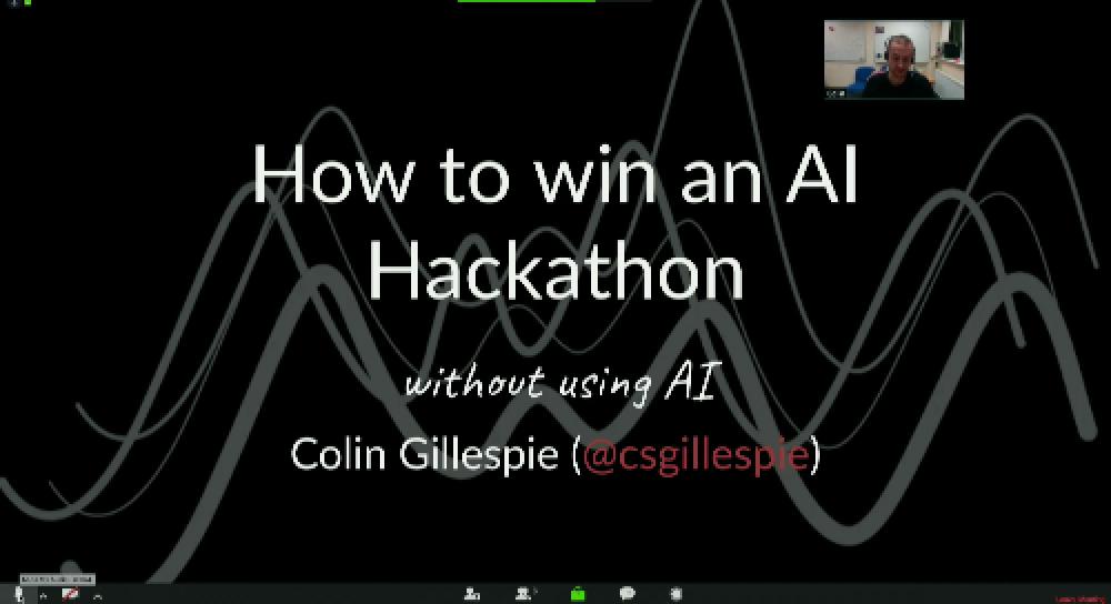
How to win an AI Hackathon, without using AI
Once “big data” is thrown into the mix, the AI solution is all but certain. But is AI always needed? See more

Building a new data science pipeline for the FT with RStudio Connect
We have recently implemented a new Data Science workflow and pipeline, using RStudio Connect and Google Cloud Services. See more
rstudio::conf 2018
Teach the Tidyverse to beginners
March 4, 2018
Storytelling with R
Imagine Boston 2030: Using R-Shiny to keep ourselves accountable and empower the public

How I Learned to Stop Worrying and Love the Firewall
Differentiating by data science
Agile data science
Achieving impact with advanced analytics: Breaking down the adoption barrier

A SAS-to-R success story
Our biostatistics group has historically utilized SAS for data management and analytics for biomedical research studies, with R only used occasionally for new methods or data visualization. Several years ago and with the encouragement of leadership, we initiated a movement to increase our usage of R significantly. See more
Understanding PCA using Shiny and Stack Overflow data
February 26, 2018
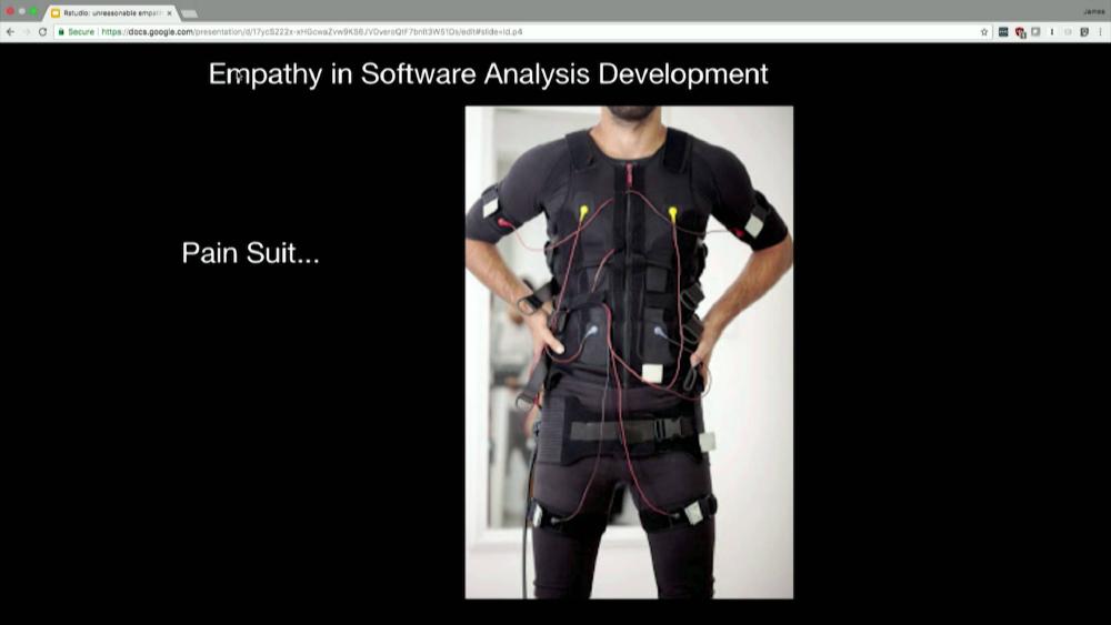
The unreasonable effectiveness of empathy
Rapid prototyping data products using Shiny
Phrasing: Communicating data science through tweets, gifs, and classic misdirection
Open-source solutions for medical marijuana
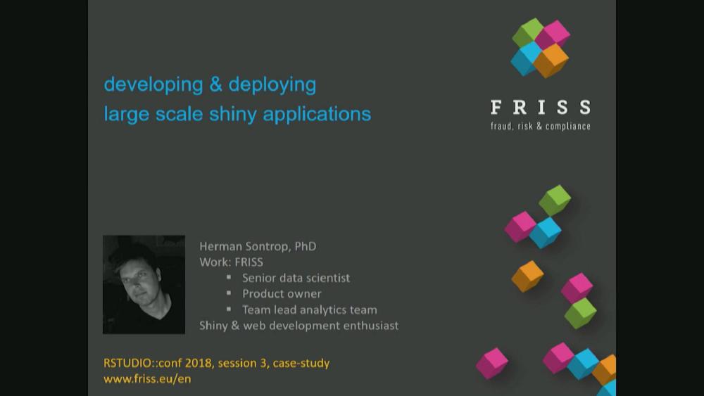
Developing and deploying large scale shiny applications
Accelerating cancer research with R
- Exploratory Data Analysis in R: Case Study
- by william surles
- Last updated about 7 years ago
- Hide Comments (–) Share Hide Toolbars
Twitter Facebook Google+
Or copy & paste this link into an email or IM:
- Statistical Analysis
- Biosignal Processing
- Data Analysis
Data Analytics in R: A Case Study Based Approach
- December 2019
- Publisher: Himalaya Publishing House Pvt. Ltd
- ISBN: 978-93-5367-791-6

- Chh. Shahu Institute of Business Education & Research

- CHHATRAPATI SHAHU INSTITUTE OF BUSINESS EDUCATION AND RESEARCH

- Shivaji University, Kolhapur
- This person is not on ResearchGate, or hasn't claimed this research yet.

Discover the world's research
- 25+ million members
- 160+ million publication pages
- 2.3+ billion citations

- Rajanish K. Kamat

- Kurt Hornik

- INT J DERMATOL
- Fahime Khozeimeh

- Yaghoub Mahboubi Oskouei

- Ramakrishnan Srikant

- Micheline Kamber

- Mohamad Roshanzamir

- Recruit researchers
- Join for free
- Login Email Tip: Most researchers use their institutional email address as their ResearchGate login Password Forgot password? Keep me logged in Log in or Continue with Google Welcome back! Please log in. Email · Hint Tip: Most researchers use their institutional email address as their ResearchGate login Password Forgot password? Keep me logged in Log in or Continue with Google No account? Sign up

Get the Reddit app
The place to discuss all things career-entry or career-related in the world of data. Do you have questions about how to get a job? Do you have suggestions or tips? Feel free to join the community!
Data analyst interview - case study
So i have an interview in twe weeks for this job that i am very interested on “data analyst” and i was told to come up with any personal project to present during the interview. Anyone have any idea or video that i can watch and practice a project as simple as possible.
I have completed 3 courses of the google data analytics certificate and I know that last course is a case study but reading about it, it seems very difficult and needs longer time and i don’t think i can complete this certificate in only two weeks.
By continuing, you agree to our User Agreement and acknowledge that you understand the Privacy Policy .
Enter the 6-digit code from your authenticator app
You’ve set up two-factor authentication for this account.
Enter a 6-digit backup code
Create your username and password.
Reddit is anonymous, so your username is what you’ll go by here. Choose wisely—because once you get a name, you can’t change it.
Reset your password
Enter your email address or username and we’ll send you a link to reset your password
Check your inbox
An email with a link to reset your password was sent to the email address associated with your account
Choose a Reddit account to continue
Pardon Our Interruption
As you were browsing something about your browser made us think you were a bot. There are a few reasons this might happen:
- You've disabled JavaScript in your web browser.
- You're a power user moving through this website with super-human speed.
- You've disabled cookies in your web browser.
- A third-party browser plugin, such as Ghostery or NoScript, is preventing JavaScript from running. Additional information is available in this support article .
To regain access, please make sure that cookies and JavaScript are enabled before reloading the page.
We Trust in Human Precision
20,000+ Professional Language Experts Ready to Help. Expertise in a variety of Niches.
API Solutions
- API Pricing
- Cost estimate
- Customer loyalty program
- Educational Discount
- Non-Profit Discount
- Green Initiative Discount1
Value-Driven Pricing
Unmatched expertise at affordable rates tailored for your needs. Our services empower you to boost your productivity.
- Special Discounts
- Enterprise transcription solutions
- Enterprise translation solutions
- Transcription/Caption API
- AI Transcription Proofreading API
Trusted by Global Leaders
GoTranscript is the chosen service for top media organizations, universities, and Fortune 50 companies.
GoTranscript
One of the Largest Online Transcription and Translation Agencies in the World. Founded in 2005.
Speaker 1: Hello and welcome to Programming for Scientific Research with Python and R. I am thrilled to have you here. In this course, you will gain practical skills in Python and R that are essential for scientific research, data analysis, and visualization. What to expect? We will embark on a comprehensive journey through both Python and R programming languages. We will start with the basics and advance to complex data handling, statistical analysis, and machine learning. Here is a brief overview of what we will cover. Getting started. We will begin with setting up your Python and R environments. You will learn how to install necessary tools and configure your workspace. Python basics. You will learn fundamental programming concepts in Python, including data types, control flow, functions, and modules. R basics. You will learn deep into R, covering functions, data types, and packages, which are essential for data analysis in R. Then data handling and manipulation. You will master file handling, data import, and manipulation in both Python and R. Then scientific computation. We will explore scientific computation libraries, perform statistical analysis, and apply zonal statistics in Python, while also covering descriptive statistics, correlations, ANOVA, and regression in R. Then learn how to create compelling visualizations with Python and R, including basic plotting, advanced graphs, and animated plots. Introduction to AI. We will introduce you to artificial intelligence concepts, process geospatial data, and deep into deep learning with both Python and R. And case studies. Apply your knowledge to real-world scientific research problems, including climate data analysis and air quality monitoring. Core structure. This course is organized into sections, each focusing on a specific topic. You will find a mix of lectures, coding exercises, quizzes, and practical assignments. Getting started. To get the most out of this course, follow the steps outlined in each lecture and actively engage with the coding exercises and quizzes. Don't hesitate to ask questions and participate in discussions. The more you practice, the more proficient you will become. Course goals. By the end of this course, you will be equipped to use Python and R for a wide range of scientific research tasks, from data manipulation and statistical analysis, to create insightful visualizations and applying machine learning techniques. Let's get started on this exciting journey together.

Google Data Analytics Capstone Project: Bellabeat
Josefina perez mercader, case study: how can a wellness technology company play it smart, introduction.
Welcome to the Bellabeat data analysis case study! In this case study, you will perform many real-world tasks of a junior data analyst. You will imagine you are working for Bellabeat, a high-tech manufacturer of health-focused products for women, and meet different characters and team members. In order to answer the key business questions, you will follow the steps of the data analysis process: ask, prepare, process, analyze, share, and act. Along the way, the Case Study Roadmap tables — including guiding questions and key tasks — will help you stay on the right path.
By the end of this lesson, you will have a portfolio-ready case study. Download the packet and reference the details of this case study anytime. Then, when you begin your job hunt, your case study will be a tangible way to demonstrate your knowledge and skills to potential employers.
You are a junior data analyst working on the marketing analyst team at Bellabeat, a high-tech manufacturer of health-focused products for women. Bellabeat is a successful small company, but they have the potential to become a larger player in the global smart device market. Urška Sršen, co-founder and Chief Creative Officer of Bellabeat, believes that analyzing smart device fitness data could help unlock new growth opportunities for the company. You have been asked to focus on one of Bellabeat’s products and analyze smart device data to gain insight into how consumers are using their smart devices. The insights you discover will then help guide marketing strategy for the company. You will present your analysis to the Bellabeat executive team along with your high-level recommendations for Bellabeat’s marketing strategy.
Characters and products
● Characters
○ Urška Sršen: Bellabeat’s co-founder and Chief Creative Officer
○ Sando Mur: Mathematician and Bellabeat’s co-founder; key member of the Bellabeat executive team
○ Bellabeat marketing analytics team: A team of data analysts responsible for collecting, analyzing, and reporting data that helps guide Bellabeat’s marketing strategy. You joined this team six months ago and have been busy learning about Bellabeat’’s mission and business goals — as well as how you, as a junior data analyst, can help Bellabeat achieve them.
○ Bellabeat app: The Bellabeat app provides users with health data related to their activity, sleep, stress, menstrual cycle, and mindfulness habits. This data can help users better understand their current habits and make healthy decisions. The Bellabeat app connects to their line of smart wellness products.
○ Leaf: Bellabeat’s classic wellness tracker can be worn as a bracelet, necklace, or clip. The Leaf tracker connects to the Bellabeat app to track activity, sleep, and stress.
○ Time: This wellness watch combines the timeless look of a classic timepiece with smart technology to track user activity, sleep, and stress. The Time watch connects to the Bellabeat app to provide you with insights into your daily wellness.
○ Spring: This is a water bottle that tracks daily water intake using smart technology to ensure that you are appropriately hydrated throughout the day. The Spring bottle connects to the Bellabeat app to track your hydration levels.
○ Bellabeat membership: Bellabeat also offers a subscription-based membership program for users. Membership gives users 24/7 access to fully personalized guidance on nutrition, activity, sleep, health and beauty, and mindfulness based on their lifestyle and goals.
About the company
Urška Sršen and Sando Mur founded Bellabeat, a high-tech company that manufactures health-focused smart products. Sršen used her background as an artist to develop beautifully designed technology that informs and inspires women around the world. Collecting data on activity, sleep, stress, and reproductive health has allowed Bellabeat to empower women with knowledge about their own health and habits. Since it was founded in 2013, Bellabeat has grown rapidly and quickly positioned itself as a tech-driven wellness company for women.
By 2016, Bellabeat had opened offices around the world and launched multiple products. Bellabeat products became available through a growing number of online retailers in addition to their own e-commerce channel on their website. The company has invested in traditional advertising media, such as radio, out-of-home billboards, print, and television, but focuses on digital marketing extensively. Bellabeat invests year-round in Google Search, maintaining active Facebook and Instagram pages, and consistently engages consumers on Twitter. Additionally, Bellabeat runs video ads on YouTube and display ads on the Google Display Network to support campaigns around key marketing dates.
Sršen knows that an analysis of Bellabeat’s available consumer data would reveal more opportunities for growth. She has asked the marketing analytics team to focus on a Bellabeat product and analyze smart device usage data in order to gain insight into how people are already using their smart devices. Then, using this information, she would like high-level recommendations for how these trends can inform Bellabeat marketing strategy
STEP 1: ASK
Business task: Analyze consumers use of an existing competitor to identify potential opportunities for growth and recommendations for the Bellabeat marketing strategy
Questions for the analysis: What are some trends in smart device usage? How could these trends apply to Bellabeat customers? How could these trends help influence Bellabeat’s marketing strategy? Key Stakeholders: · Urška Sršen — Bellabeat’s co-founder and Chief Creative Officer
· Sando Mur — Mathematician and Bellabeat’s co-founder; key member of the Bellabeat executive team
· Bellabeat marketing analytics team — A team of data analysts responsible for collecting, analyzing, and reporting data that helps guide Bellabeat’s marketing strategy.
STEP 2: PREPARE
The data for this analysis will come from FitBit Fitness Tracker Data on Kaggle. These 18 data-sets were generated by respondents to a distributed survey via Amazon Mechanical Turk between 03.12.2016–05.12.2016. Thirty eligible Fitbit users consented to the submission of personal tracker data, including minute-level output for physical activity, heart rate, and sleep monitoring. Individual reports can be parsed by export session ID (column A) or time stamp (column B). Variation between output represents use of different types of Fitbit trackers and individual tracking behaviors / preferences.
Limitations for this data exist due to the sample size and absence of key characteristics of the participants, such as gender, age, location, lifestyle.
For this analysis the data sets for daily activity, daily calories, daily intensities, daily steps, heart rate by seconds, minute METs, daily sleep, and weight log information, will be used.
Because of the largeness of the data sets being used, R Studio was used to prepare, process and complete this analysis of which the many packages and data visualization features available therein can be used to explore the data.
Import the datasets:
The csv files were then imported into R Studio and the data frames were created with simplified names. In order to ensure the data frames were imported correctly the head() function was used. Then the tibble() function was used to take a look at the data and check if the data was in the correct format.
STEP 3: PROCESS
By taking a look at the data it can be observed that the dailyActivity_merged data frame contains the information of the following data frames combined: dailyCalories_merged dailyIntensities_merged dailySteps_merged In order to avoid Redundancy in this analysis, we are only going to use the dailyActivity_merged data frame that contains all the information together.
Change Data Formats: The ActivityDate column in the
dailyActivity_merged data frame is in chr format instead of Date format. The date format mdy was used to change it into the correct format:
The same applies to the ActivityMinute in the minuteMETsNarrow_merged, the Time column in the heartrate_seconds_merged data frame, the Date column in the weightLogInfo_merged data frame and the SleepDay column in the sleepDay_merged data frame. But in this case the date format is different, it includes hour:minutes:seconds, so the date format used was mdy_hms:
STEP 4: ANALYZE
Summarize the data:.
The n_distinct() and nrow() functions are used to determine the number of unique values and the number of rows in a data frame, respectively.
As previously mentioned, the heartrate_seconds_merged and weightLogInfo_merged data frames contain data from only 30 participants, which is not enough to make reliable conclusions. Although, we will use this data o identify some patterns.
The summary() function is used to pull key statistics about the data frames.
Daily Activity Analysis
Total Steps: The average daily steps are 7638, which is below of 10,000, which is what the National Institutes of Health recommends to reduce your risk for cancer, heart disease and early death.
Very Active Minutes: On average, the users get 21.16 minutes of very activity per day, which means the users are getting 148.12 minutes of physical activity a week. This is bellow of what the CDC (Centers for Disease Control and Prevention) recommends, which is 150 minutes a week.
Sedentary Minutes: The CSEP (Canadian Society for Exercise Physiology) recommends not spending more then 8 ahours a day of sedentary time. If we take into account that the recommended amount of sleep is 8 hours (480 minutes) and the average of the users have a 991.20 minutes of sedentary time, we can assume that while awake, our users are 8.52 hours a day (991.2 minutes = 16.52 hours less than 8 hours sleep equals to 8.52 hours) which is slightly more of the that the CSEP recommends.
Calories The average FitBit user burns 2304 calories a day, which is more than the Clevelamd Clinic says a body should burn without physical activity. This means the users are somehow active during the course of the day.
MET (Metabolic equivalents)
The average of the FitBit user has a metabolic equivalent of 14.69. According to the Harvard School of Public Healh, One MET is the amount of energy used while sitting quietly.For example, reading may use about 1.3 METs while running may use 8-9 METs. METs can also be translated into light, moderate, and vigorous intensities of exercise.
Sedentary—Uses 1.5 or fewer METs. Examples are sitting, reclining, or lying down. Light intensity—Uses from 1.6-3.0 METs. Examples are walking at a leisurely pace or standing in line at the store. Moderate intensity—Uses from 3.0-6.0 METs. Examples are walking briskly, vacuuming, or raking leaves. Vigorous intensity—Uses from 6.0+ METs. Examples are walking very quickly, running, taking an aerobics class, or shoveling snow.
An average on 14.69 MET is an unlikely value and this might lead to the conclusion that the data point is not calculated accurately. Due to this, this data frame will no longuer be used in the analysis.
The average heart rate is 73 bpm. According to the Cleveland Clinic, the average “normal” heart rate for an adult is between 600-100 bpm which means the FitBit users fall in the normal range.
Daily Sleep
The summary of the Daily Sleep Data frame is telling us that the average user sleeps 419.5 minutes a day, which is the equivalent to 6.99 hours. This data is close to the CDC range which recommends that an adult should sleep more than 7 hours a day.
BMI is a common tool that measures a person’s weight in relation to their height. The summary of the weight log info shows that the average user has a BMI of 25.19. According to Medical News, the ideal BMI is between 18.5 to 24.99. But this article also mentions that BMI is a very simple measurement. While it takes height into consideration, it does not account for factors such as: waist or hip measurements the proportion or distribution of fat the proportion of muscle mass So this data by itself does not diagnose how overweight a sample is.
Create Reports
Based on the previous analysis, some reports were created to display critical information and evolution of the average data over time to identify some trends:
STEP 5: SHARE
The ggplot() and gganimate() functions of R Studio were used to create data visualizations that depict patterns and trends found in the data frames, which can give us further insights for this project.
First Plot: Relationship between Very Active Minutes and Calories burned
A positive Relationship between Very Active Minutes and Calories burned has been identified. The more active a user stays, the more calories they burn.
Second Plot: Relationship between Total Steps and Calories burned
A positive Relationship between Total Steps and Calories burned has been identified. The more a user walks, the more calories they burn.
Third Plot: Relationship between Distance and Calories burned
A positive Relationship between Distance and Calories burned has been identified.
Fourth Plot: Average Daily Calories burned Over Time
This graphs shows that users has tend to burn similar amount of calories during the month analyzed, with a few and not too pronounced peaks or minimums
Fifth Plot: Average Very Active Minutes Over Time
This graphs shows that users has tend to stay active during the month analyzed, with a trend going down on minutes active.
Sixth Plot: Average Steps Over Time
This graphs shows that users walked similar amount of steps during the month analyzed, with some pronounced peaks and minimums, which shows an unsteady trend.
Sixth Plot: Average Sleep hours Over Time
This graphs shows that users slpet no less than 5.5 hours a day on average and no more than 10.5 hours a day.
STEP 6: ACT
As a final step, several recommendations were written to BellaBeat stakeholders.
Recommendations for Bellabeat:
- Target sedentary individuals by including reminders to move, personalized activity goals and set up challenges to enhance average daily physical activity.
- Emphasize and educate about the importance of physical activity: including blogs and newsletters based on scientific information about the importance of having an active life to live longer and a better life.
- Promote Sleep healthy habits: include in the newsletters and blogs articles about the importance of sleeping to minimizing the risks of having physical and mental illness. Promote healthy habits before sleeping via reminders and personalized sleep tips.
- Enhance Heart Rate Monitoring: The average heart rate falls within the normal range, indicating that users have generally healthy heart rates. BellaBeat can further develop their heart rate monitoring features to provide more detailed insights into users’ cardiovascular health. This can include tracking resting heart rate trends, providing heart rate zone guidance during workouts, and integrating with other health metrics for a comprehensive view of overall health and fitness.
- Personalize marketing recommendations: use the available data to tailor personalize marketing campaigns and recommendations to users. Send insights and reminders to users to increase engagement by providing them useful information.
- Collaborate with Health and Wellness influencers: make social media collaborations and partner with influencers and persons of interest whose values aligns with BellaBeat’s. This could attract more users that follow those influencers.
- Leverage user testimonials and Success stories: collect successful histories to demonstrate real life impact of the BellaBeat customers in social media and blogs. Highlight the mission of BellaBeat and how tis missipon has helped individuals with their health and goals.
- Enhance User Experience and App Features: continuously work to improve BellaBeat apps’ user experience. Make regular updates, show insights on a regular basisand survey the customers for suggestions on the app.
Works Cited:
- Sandee LaMotte,CNN. (2022, October 10). 10 steps for weight loss and wellness. Retrieved from https://www.cnn.com/2022/10/10/health/steps-for-weight-loss-wellness/index.html
- Centers for Disease Control and Prevention. (n.d.). Physical Activity - Basics - Adults. Retrieved from https://www.cdc.gov/physicalactivity/basics/adults/index.html Canadian
- Society for Exercise Physiology. (n.d.). Canadian 24-Hour Movement Guidelines for Adults. Retrieved from https://csepguidelines.ca/
- Cleveland Clinic. (n.d.). Calories Burned in a Day. Retrieved from https://health.clevelandclinic.org/calories-burned-in-a-day/ Harvard
- T.H. Chan School of Public Health. (n.d.). Staying Active. Retrieved from https://www.hsph.harvard.edu/nutritionsource/staying-active/
- Cleveland Clinic. (n.d.). Pulse (Heart Rate). Retrieved from https://my.clevelandclinic.org/health/diagnostics/17402-pulse--heart-rate
- Centers for Disease Control and Prevention. (n.d.). How Much Sleep Do I Need? Retrieved from https://www.cdc.gov/sleep/about_sleep/how_much_sleep.html Medical News Today. (n.d.). What to know about BMI and body fat percentage. Retrieved from https://www.medicalnewstoday.com/articles/323446#body-mass-index-bmi
- Submit a Manuscript
- Advanced search

American Journal of Neuroradiology
Advanced Search
Endovascular Thrombectomy for Carotid Pseudo-Occlusion in the Setting of Acute Ischemic Stroke: A Comparative Systematic Review and Meta-analysis
- Find this author on Google Scholar
- Find this author on PubMed
- Search for this author on this site
- ORCID record for Michelle A. Toruno
- ORCID record for Tristan Meier
- ORCID record for Mohamed Elfil
- ORCID record for Sherief Ghozy
- ORCID record for Ramanathan Kadirvel
- ORCID record for David F. Kallmes
- Figures & Data
- Supplemental
- Info & Metrics
This article requires a subscription to view the full text. If you have a subscription you may use the login form below to view the article. Access to this article can also be purchased.
BACKGROUND: The effective treatment for patients with acute ischemic stroke (AIS) with cervical internal carotid pseudo-occlusion (cICA-PO) requires comprehensive research on the safety and outcomes of endovascular thrombectomy (EVT). However, there are limited data available, highlighting the need for further research to ensure better treatment strategies and improve the quality of care for these patients.
PURPOSE: This study aims to assess the management and outcomes in this population group compared with patients with true carotid occlusion.
DATA SOURCES: Following the Preferred Reporting Items for Systematic Reviews and Meta-Analysis guidelines, a comprehensive systematic review was conducted by using PubMed, Embase, Web of Science, and Scopus from database inception to November 2023.
STUDY SELECTION: The size of the included studies ranged from 16 patients to 146 patients. Through the 4 full-text articles, a total of 259 patients were collected. We compared outcomes between patients with cICA-PO compared with patients with true carotid occlusions undergoing EVT due to AIS. We excluded studies with patients with carotid pseudo-occlusion without stroke, review articles, duplicate studies, overlapped data that included the same patients presented in another included study, case reports, case series with fewer than 5 patients, and meeting abstracts that did not contain the outcomes of interest. We did not pose any limitations regarding sample size or patient characteristics.
DATA ANALYSIS: We utilized the R statistical software (V.4.3.1; R package meta) to conduct the analysis of all the data obtained. We calculated the OR for binary variables, and the corresponding 95% CI. To synthesize the data, random-effect models, as well as forest plots were generated to visually represent the synthesis of the data. Additionally, we assessed heterogeneity by using Cochran Q and I 2 tests. A P value < .05 for the Q statistic or I 2 more than 50% suggests notable heterogeneity. Based on a small number of studies (<10), the assessment of publication bias could not be reliably performed.
DATA SYNTHESIS: This meta-analysis encompassed data from 4 studies. Patients with cICA-PO and AIS who underwent EVT ( n = 135) exhibited lower rates of functional independence (OR = 0.35; 95% CI, 0.20–0.61; P < .001) compared with patients with true occlusions ( n = 103), as well as successful recanalization rates (OR = 0.39; 95% CI, 0.20–0.74; P = .004). In addition, the cICA-PO group experienced higher mortality and symptomatic intracranial hemorrhage (sICH) compared with the group with true carotid occlusions (OR = 2.62; 95% CI, 0.21–7.24; and OR = 2.23; 95% CI, 1.00–4.95; P = .049, respectively).
LIMITATIONS: Individual patient data were not available. Studies were a retrospective design and some of the studies had small sample sizes. The included studies in our meta-analysis did not exclude patients with tandem occlusions that might influence the results of the comparison.
CONCLUSIONS: Compared with patients with true carotid occlusion, the cICA-PO group with AIS undergoing EVT presented poor outcomes with lower functional independence and successful recanalization, as well as higher sICH and mortality rates.
- ABBREVIATIONS:
- © 2024 by American Journal of Neuroradiology
Log in using your username and password
In this issue.

- Table of Contents
- Index by author
- Complete Issue (PDF)
Thank you for your interest in spreading the word on American Journal of Neuroradiology.
NOTE: We only request your email address so that the person you are recommending the page to knows that you wanted them to see it, and that it is not junk mail. We do not capture any email address.
Citation Manager Formats
- EndNote (tagged)
- EndNote 8 (xml)
- RefWorks Tagged
- Ref Manager

- Tweet Widget
- Facebook Like
- Google Plus One
Jump to section
- MATERIALS AND METHODS
- CONCLUSIONS
Related Articles
- Google Scholar
Cited By...
- No citing articles found.
This article has not yet been cited by articles in journals that are participating in Crossref Cited-by Linking.
More in this TOC Section
- MCA Parallel Anatomic Scanning MR Imaging–Guided Recanalization of a Chronic Occluded MCA by Endovascular Treatment
- Incidence, Risk Factors, and Clinical Implications of Subarachnoid Hyperdensities on Flat-Panel Detector CT following Mechanical Thrombectomy in Patients with Anterior Circulation Acute Ischemic Stroke
Similar Articles
- Open access
- Published: 05 September 2024
Node attribute analysis for cultural data analytics: a case study on Italian XX–XXI century music
- Michele Coscia 1
Applied Network Science volume 9 , Article number: 56 ( 2024 ) Cite this article
Metrics details
Cultural data analytics aims to use analytic methods to explore cultural expressions—for instance art, literature, dance, music. The common thing between cultural expressions is that they have multiple qualitatively different facets that interact with each other in non trivial and non learnable ways. To support this observation, we use the Italian music record industry from 1902 to 2024 as a case study. In this scenario, a possible research objective could be to discuss the relationships between different music genres as they are performed by different bands. Estimating genre similarity by counting the number of records each band published performing a given genre is not enough, because it assumes bands operate independently from each other. In reality, bands share members and have complex relationships. These relationships cannot be automatically learned, both because we miss the data behind their creation, but also because they are established in a serendipitous way between artists, without following consistent patterns. However, we can be map them in a complex network. We can then use the counts of band records with a given genre as a node attribute in a band network. In this paper we show how recently developed techniques for node attribute analysis are a natural choice to analyze such attributes. Alternative network analysis techniques focus on analyzing nodes, rather than node attributes, ending up either being inapplicable in this scenario, or requiring the creation of more complex n-partite high order structures that can result less intuitive. By using node attribute analysis techniques, we show that we are able to describe which music genres concentrate or spread out in this network, which time periods show a balance of exploration-versus-exploitation, which Italian regions correlate more with which music genres, and a new approach to classify clusters of coherent music genres or eras of activity by the distance on this network between genres or years.
Introduction
Node attribute analysis has recently been enlarged by the introduction of techniques to calculate the variance of a node attribute (Devriendt et al. 2022 ), estimate distances between two node attributes (Coscia 2020 ), calculating their Pearson correlations (Coscia 2021 ), and cluster them (Damstrup et al. 2023 ) without assuming they live in a simple Euclidean space—or learnable deformation thereof.
These techniques are useful only insofar the network being analyzed has rich node attribute data, and that analyzing their relationships is interesting. This is normally the case in cultural analytics, the use of analytic methods for the exploration of contemporary and historical cultures (Manovich 2020 ; Candia et al. 2019 ). Example range from archaeology—where related artifacts have a number of physical characteristics and can be from different places/ages (Schich et al. 2008 ; Brughmans 2013 ; Mills et al. 2013 ); to art history—where related visual artifacts can be described by a number of meaningful visual characteristics (Salah et al. 2013 ; Hristova 2016 ; Karjus et al. 2023 ); to sociology—where different ideas and opinions distribute over a social network as node attributes (Bail 2014 ; Hohmann et al. 2023 ); to linguistics—with different people in a social network producing content in different languages (Ronen et al. 2014 ); to music—with complex relations between players and informing meta-relationships between the genres they play (McAndrew and Everett 2015 ; Vlegels and Lievens 2017 ).
In this paper we aim at showing the usefulness of node attribute analysis in cultural analytics. We focus on the Italian record music industry since its beginnings in the early XX century until the present time. We build a temporally-evolving bipartite network connecting players with the bands they play in. For each band we know how many records of a given genre they publish, whether they published a record in a given year, and from which Italian region they originate—all node attributes of the band. By applying node attribute analysis, we can address a number of interesting questions. For instance:
How related is a particular music genre to a period? Or to a specific Italian region?
Is the production of a specific genre concentrated in a restricted group of bands or generally spread through the network?
Does clustering genres according to their distribution on the collaboration network conform to our expectation of meta-genres or can we discover a new network-based classification?
Can we use the productivity of related bands across the years as the basis to find eras in music production?
The music scene has been the subject of extensive analysis using networks. Some works focus on music production as an import–export network between countries (Moon et al. 2010 ). Other model composers and performers as nodes connected by collaboration or friendship links (Stebbins 2004 ; Park et al. 2007 ; Gleiser and Danon 2003 ; Teitelbaum et al. 2008 ; McAndrew and Everett 2015 ). Studies investigate how music consumption can inform us about genres (Vlegels and Lievens 2017 ) and listeners influencing each other (Baym and Ledbetter 2009 ; Pennacchioli et al. 2013 ; Pálovics and Benczúr 2013 ). Differently from these studies, we do not focus on asking questions about the network structure itself. For our work, the network structure is interesting only insofar it is the mediator of the relationships between node attributes—the genres, years, and regions the bands are active on –, rather than being the focus of the analysis.
This is an important qualitative distinction, because if one wanted to perform our genre-regional analysis on the music collaboration network without our node attribute analysis, they would have to deal with complex n-partite objects—a player-band-year-genre-region network—which can become unwieldy and unintuitive. On the other hand, with our approach one can work with a unipartite projection of the player-band relationships, and use years, genres, and regions as node attributes, maintaining a highly intuitive representation.
Deep learning techniques and specifically deep neural networks can handle the richness of our data (Aljalbout et al. 2018 ; Aggarwal et al. 2018 ; Pang et al. 2021 ; Ezugwu et al. 2022 ). These approaches can attempt to learn, e.g., the true non-Euclidean distances between genres played by bands (Mahalanobis 1936 ; Xie et al. 2016 ). The problem is that this learning is severely limited if the space is defined by a complex network (Bronstein et al. 2017 ), as is the case here. Therefore, one would have to use Graph Neural Networks (GNN) (Scarselli et al. 2008 ; Wu et al. 2022 ; Zhou et al. 2020 ). However, GNNs focus on node analysis (Bo et al. 2020 ; Tsitsulin et al. 2020 ; Bianchi et al. 2020 ; Zhou et al. 2020 ), usually via finding the best way of creating node embeddings (Perozzi et al. 2014 ; Hamilton et al. 2017 ). GNNs only use node attributes for the purpose of aiding the analysis of nodes rather than analyzing the attributes themselves (Perozzi et al. 2014 ; Zhang et al. 2019 ; Wang et al. 2019 ; Lin et al. 2021 ; Cheng et al. 2021 ; Yang et al. 2023 ). Previous research shows that, when focusing on node attributes rather than on nodes, the techniques we use here are more suitable than adapting GNNs developed with a different focus (Damstrup et al. 2023 ).
Another class of alternative to deal with this data richness is to use hypergraphs (Bretto 2013 ) and high order networks (Bianconi 2021 ; Benson et al. 2016 ; Lambiotte et al. 2019 ; Xu et al. 2016 ). With these techniques, it is possible to analyze relationships involving multiple actors at the same time—rather than only dyadic relationships like in simpler network representations—and encode path dependencies—e.g. using high order random walks where a larger portion of the network is taken into account to decide which node to visit next (Kaufman and Oppenheim 2020 ; Carletti et al. 2020 ). While a comparative analysis between these techniques and the ones used in this paper is interesting, in this paper we exclusively focus on the usefulness of techniques based on node attribute analysis. We leave the comparison with hypergraphs and high order networks as a future work.
Our analysis shows that the node attribute techniques can help addressing a number of interesting research tasks in cultural data analytics. We show that we are able to describe the eclecticism required by music genres—or expressed in time periods –, by how dispersed they are on the music network. We can determine the geographical connection of specific genres, by estimating their correlation not merely based on how many bands from a specific region play a genre, but how bands not playing that genre relate with those that do. We can create new genre categories by looking at how close they are to each other on the music network. We can apply the same logic to discover eras in Italian music production, clustering years into coherent periods.
Finally, we show that our node attribute analysis rest on some assumptions that are likely to be true in our network—that bands tend to share artists if they play similar genres, in similar time periods, and hailing from similar regions.
We release our data as a public good freely accessible by anyone (Coscia 2024 ), along with all the code necessary to reproduce our analysis. Footnote 1
In this section we present our data model and a summary description of the data’s main features. Supplementary Material Section 1 provides all the details necessary to understand our choices when it comes to data collection, cleaning, and pre-processing.
To obtain a coherent network and to limit the scope of our data collection, we focus exclusively on the record credits from published Italian bands. The data from this project comes from crowd-sourced user-generated data. We mainly use Wikipedia Footnote 2 and Discogs. Footnote 3 We should note that these sources have a bias favoring English-speaking productions. While this bias does not affect our data collection too much, since we focus on Italy without comparing it to a different country/culture, it makes it more likely that there are Italian records without credits, or that are simply missing.
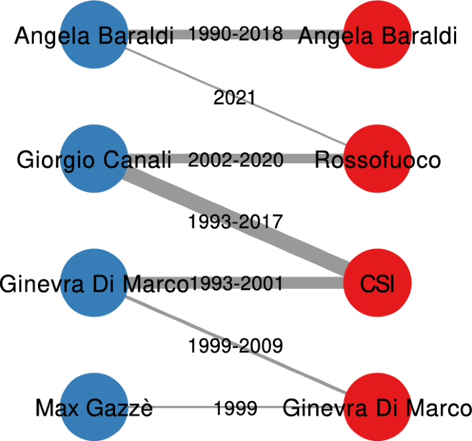
Our bipartite network data model. Artists in blue, bands in red. Edges are labeled with the first-last year in which the collaboration was active. The edge width is proportional to the weight, which is the number of years in which the artist participated to records released by the band
Figure 1 shows our data model, which is a bipartite network \(G = (V_1, V_2, E)\) . The nodes in the first class \(V_1\) are artists. An artist is a disambiguated physical real person. The nodes in the second class \(V_2\) are bands, which are identified by their name. Note that we consider solo artists as bands, and they are logically different from the artist with the same name. Note how in Fig. 1 we have two nodes labeled “Ginevra Di Marco”, one in red for the band and the other in blue for the artist.
Each edge \((v_1, v_2, t)\) —with \(v_1 \in V_1\) and \(v_2 \in V_2\) —connects an artist if they participated in a record of the band. The bipartite network is temporal. Each edge has a single attribute t reporting the year in which this performance happened. This implies that there are multiple edges between the same artist and the same band, one per year in which the connection existed—for notation convenience, we can use \(w_{v_1,v_2}\) to denote this count for an arbitrary node pair \((v_1, v_2)\) , since it is equivalent to the edge’s weight.
We have multiple attributes on the band. The attributes are divided in three classes. First, we have genres. We recover from Discogs 477 different genres/styles that have been used by at least one band in the network. Each of these genres is an attribute of the band, and the value of the attribute is the number of records the band has released with that genre. We use S to indicate the set of all genres, and show an example of these attributes in Table 1 (first section). The second attribute class is the one-hot encoded geographical region of origin, with each region being a binary vector equal to one if the band originates from the region, zero otherwise. We use R to indicate the set of regions. Table 1 (second section) shows a sample of the values of these attributes. The final attribute class is the activity status of a band in a given year—with Y being the set of years. Similarly to the geographical region, this is a one-hot encoded binary attribute. Table 1 (third section) shows a sample of the values of these attributes.
Summary description
For the remainder of the paper, we limit the scope of the analysis to a projection of our bipartite network. We focus on the band projection of the network, connecting bands if they share artists. We do so to keep the scope contained and show that even by looking at a limited perspective on the data, node attribute analysis can be versatile and open many possibilities. Supplementary Section 2 contains summary statistics about the bipartite network and the other projection—connecting artists with common bands.
There are many ways to perform this projection (Newman 2001 ; Zhou et al. 2007 ; Yildirim and Coscia 2014 ), which result in different edge weights. Here we weight edges by counting the number of years a shared artist has played for either band. Supplementary Material Section 1 contains more details about this weighting scheme. Since we care about the statistical significance—assuming a certain amount of noise in user-generated data—we deploy a network backboning technique to ensure we are not analyzing random fluctuations (Coscia and Neffke 2017 ).
Table 2 shows that the band projection has a low average degree and density, with high clustering coefficient and modularity—which indicate that one can find meaningful communities in the band projection. These are are typical characteristics of a wide variety of complex networks that can be found in the literature.
Table 3 summarizes the top 10 bands according to three standard centrality measures: degree, closeness, and betweenness centrality. Degree is biased by the density of the hip hop cluster—which, as we will see, is a large quasi-clique, including only hip hop bands. Closeness is mostly dominated by alternative rock bands, as they happen to be in the center of mass of the network. The top bands according to betweenness are those bands that are truly the bridges connecting different times, genres, and Italian regions. Note that we analyze the network as a cumulative structure, therefore these centrality rankings are prone to overemphasize bands that are in the central period of the network, as they naturally bridge the whole final structure. In other words, it is harder to be central for very recent or very old bands.
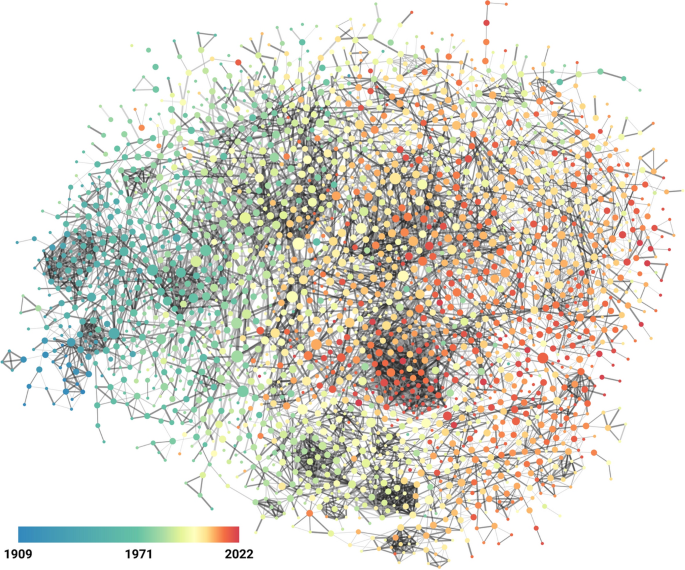
The temporal component of the band projection. Each node is a band. Edges connect bands with significant number of artist overlap. The edge’s color encodes its statistical significance (in increasing significance from bright to dark). The edge’s thickness is proportional to the overlap weight. The node’s size is proportional to its betweenness centrality. The node’s color encodes the average year of the band in the data—from blue (low year, less recent) to red (high year, more recent)
We visualize the band projection to show visually the driving forces behind the edge creation process: temporal and genre assortativity. For this reason we produce two visualizations. First, we take on the temporal component in Fig. 2 . The network has a clear temporal dimension, which we decide to place on a left-to-right axis in the visualization, going from older to more recent.
Second, we show the genre component in Fig. 3 , which instead causes clustering—the tendency of bands playing the same genre to connect to each other more than with any other band. For simplicity, we focus on the big three genres—pop, rock, and electronic—plus hip hop, since the latter creates the strongest and most evident cluster notwithstanding being less popular than the other three genres. For each node, if the band published more than a given threshold records in one of those four genres, we color the node with the most popular genre among them. If none of those genres meets the threshold, we count the band as playing an “other” generic category.
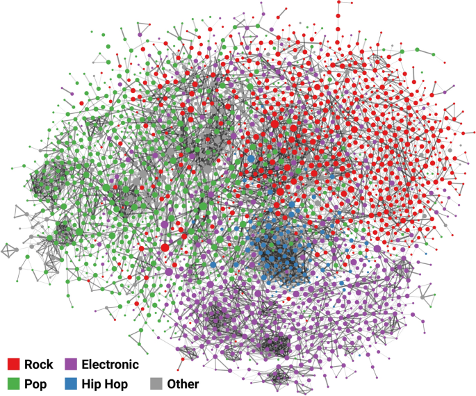
The genre component of the band projection. Same legend as Fig. 2 , except for the node’s color. Here, color encodes the dominant genre among pop (green), rock (red), electronic (purple), hip hop (blue), and other (gray)
This node categorization achieves a modularity score of 0.524, which is remarkably high considering that it uses no network information at all—and it is not a given that this is the correct number of communities. This is a sign that the network is strongly assortative by genre. With our division in four genres plus other, we observe an assortativity coefficient of 0.689, which is quite high. The assortativity coefficient for the average year of activity is even higher (0.91).
We omit showing the network using the regional information on the bands for two reason. First, there are too many regions (20) to visualize them by using different colors for nodes. Second, the structural relationship between the network and the regions is weaker—the assortativity coefficient being 0.223—which would lead to a less clear visualization.
From the figures and the preliminary analysis, it appears quite evident that the structure of the network has a set of complex and interesting interactions with time, genres, and, to a lesser extent, geography. This means that it is meaningful to use the network structure to estimate the relationship between genres, time, and space. This is the main topic of the paper and we now turn our attention to this analysis.
In this section we investigate a number of potential research questions in cultural data analytics. Each of them is tackled with a different node attribute analysis technique: network variance (Devriendt et al. 2022 ), network correlation (Coscia 2021 ; Coscia and Devriendt 2024 ), and Generalized Euclidean distance (Coscia 2020 )—which is at the basis of node attribute clustering (Damstrup et al. 2023 ) and era discovery. Supplementary Material Section 3 explains in details each of these methods.
Genre specialization
When focusing on the genre attributes of the nodes, their network variance can tell us how concentrated or dispersed they are in the network. A disperse genre means that the bands playing that genre do not share artists, not even indirectly: they are scattered in the structure. Vice versa, a low-variance genre implies that there is a clique of artist playing it, and they are shared by most of the bands releasing records with that particular genre. Table 4 reports the five most (and least) concentrated genres in the network.
We only focus on genres that have a minimum level of use, in this specific case at least 1% of bands must have released at least one record using that specific genre. The values of network variance should be compared with a null version of the genre—the values themselves do not tell us whether they are significant or if we would get that level of variance simply given the popularity of the genre. For this reason we bootstrap a pseudo p-value for the variance.
Let’s assume that \(\mathcal {S}\) is a \(|V| \times |S|\) genre matrix. The \(\mathcal {S}_{v,s}\) entry tells us how many records with genre s the band v has published. We can create \(\mathcal {S}'\) , a randomized null version of \(\mathcal {S}\) . In \(\mathcal {S}'\) , we ensure that each null genre has the same number of records as it has in \(\mathcal {S}\) . We do so by extracting with replacement at random \(\sum \limits _{v \in V} \mathcal {S}_{v,s}\) bands for genre s . The random extraction is not uniform: each band has a probability of being extracted proportional to \(\sum \limits _{s \in S} \mathcal {S}_{v,s}\) . In this way, \(\mathcal {S}'\) has the same column sum and similar row sum as \(\mathcal {S}\) . In other word, we randomize \(\mathcal {S}\) preserving the popularity of each genre and each band. Then, we can count the number of such random \(\mathcal {S}'\) s in which the null genre has a higher (lower) variance than the observed genre.
Table 4 shows that stoner rock has a high and significant variance, indicating that bands playing stoner rock have a low degree of specialization. This can be contextualized by the fact that stoner rock was tried out unsystematically by a few unrelated bands, ranging from heavy metal to indie rock. On the other hand, many variants of heavy metal have low variance. This can be explained by the fact that heavy metal is a niche genre in Italy, and all bands playing specific heavy metal variants know each other and share members.
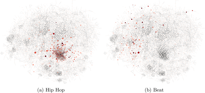
Two genres ( a Hip Hop, b Beat) with different variance. Node size, node definition, and edge thickness, color, and definition is the same as Fig. 2 . The color is proportional to the genre-band node attribute value, with bright colors for low values and dark colors for high values
In Fig. 4 we pick two representative genres—Hip Hop and Beat—which both have the same relatively high popularity in number of bands playing them, and have a significant (low or high) variance and we show how they look like on the network. The figure shows that the variance measure does what we intuitively think it should be doing: the Hip Hop bands have low variance and therefore strongly cluster in the network, while the Beat bands are more scattered.
Temporal variety
We are not limited to the calculation of variances for genres: we can perform the same operation for the years. If the variance of a genre tells us how diverse the set of bands playing is, the variance of a year can tell us how diverse the year was. Figure 5 shows the evolution of variances per year. We test the statistical significance of the observed variance value by shuffling the values of the node attribute for a given year a number of times, testing whether the observation is significantly higher, lower, or equal to this expectation.
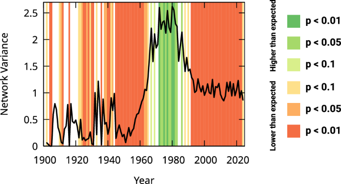
The network variance (y axis) for a given decade (x axis). Background color indicates the statistical significance: red = lower than expected, green = higher than expected, white = not significantly different from expectation
From the figure we can see that there seems to be two phase transitions. In the first regime, we have an infancy phase with low activity and low variance. The first phase transition starts in the year 1960 and brings the network to a second regime of high activity and high variance. After the peak around the year 1980, a second phase transition introduces the third regime from the mid 90 s until the present, with high activity but low variance. In the latter years, we see hip hop cannibalizing all genres and compressing the record releases to its tightly-knit cluster.
Node attribute correlation
We can now shift our attention from describing a single node attribute at a time—its variance as we saw in the previous sections—to describing the relationships between pairs of attributes. In this section, we do so by calculating their network correlation. Specifically, we want to make a geographical analysis. The ultimate aim is to answer the question: what are some particular strong genre-region associations? We can answer the question by calculating the network correlation between two node attributes, one recording the genre intensity for a band and the other a binary value telling us whether the band is from a specific region or not. The network correlation is useful here, because it grows not only if there are a lot of bands playing that specific genre in that specific region, but also if the other bands in the region that do not play that genre are close in the network to—i.e. share members with—bands playing that genre.
In Table 5 we report some significant region-genre associations. For each region, we pick the most popular genre in the network to which they correlate at a significant level—and they have the highest correlation among all other regions that correlate significantly to that genre. The significance is estimated via bootstrapping, by randomly shuffling the region vector—i.e. changing the set of bands associated to the region while respecting its size. Table 5 does not report a genre for all regions, because for some regions there was no genre satisfying the constraints. Note that some regions might correlate more strongly or more significantly with a genre that is not reported in the table, but we omit it if there was another region with a stronger correlation for that genre.
Genre clusters
When we measure the pairwise distance between all node attributes systematically we can cluster them hierarchically. Here, we do such a network-based hierarchical clustering on the music genres and styles as recorded by Discogs. The aim is to see whether we can find groups of genres that are similar to each other, potentially informing a data-driven musical classification. Figure 6 shows a bird’s eye view of the hierarchical clustering, with the similarity matrix and the dendrogram.
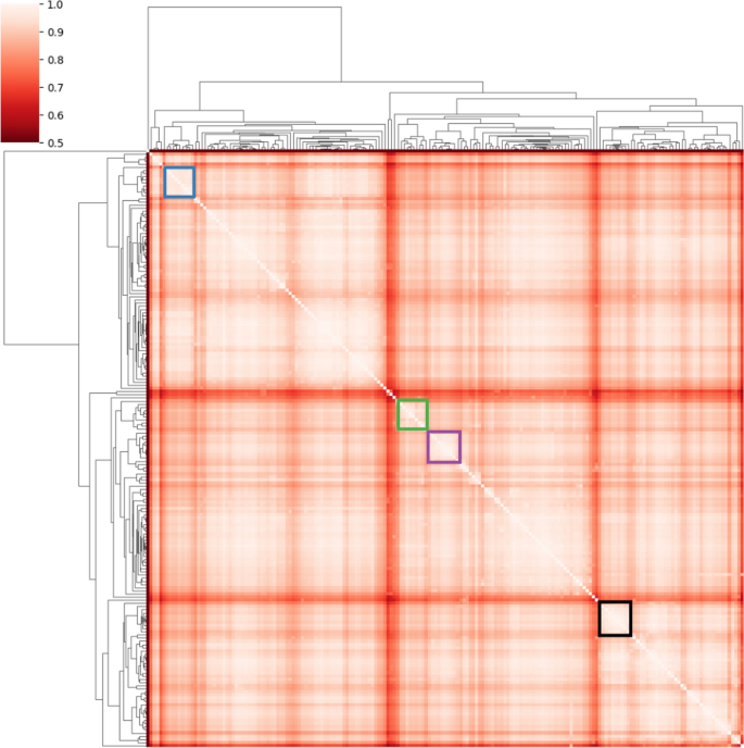
The hierarchical genre clusters. The heatmap shows the pairwise similarity among the genres—from low (dark) to high (bright) similarity. The dendrograms show the hierarchical organization of the clusters
To make sense of it, we have selected some clusters, for illustrative purposes only. Table 6 shows what genres and styles from Discogs end up in the color-highlighted clusters from Fig. 6 . We can see that the clusters include similar genres which make as a coherent set of more general music styles. The figure also highlights that there is a hierarchical structure of music styles, with meaningful clusters-within-clusters, and clear demarcation lines between groups and subgroups.
Recall that these clusters are driven exclusively by the network’s topology and do not use any feature coming from the songs themselves. This means that using a network of shared members among bands is indeed insightful in figuring our the related genres these bands play. Therefore, network-based clustering has the potential to guide the definition of new musical classifications.
Temporal clusters
We now look at the eras of Italian music we can discover in the data. Figure 7 shows the dendrogram, connecting years and groups of years at a small network distance to each other. Each era we identify colors its corresponding branch in the dendrogram. We avoid assigning an era for years pre-1906 and post-2018, due to issues with the representativeness of the data. We also notice that the 1938–1945 period is tumultuous, with many small eras in a handful of years, which is understandable given the geopolitical situation at a time, and so we ignore that period as well.
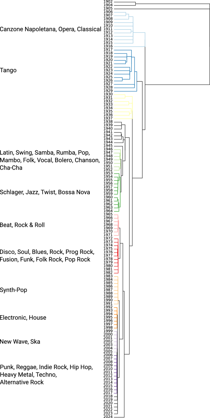
The eras dendrogram. Clusters join at a height proportional to their similarity level (the more right, the less similar). Colors encode the detected eras with labels on the left
To make sense of temporal clustering, the standard approach in the literature would be to compare counts of activities across clusters. However, that would ignore the role of the network structure. In our framework, we can characterize eras applying the same logic used to find them. We calculate the network distance between a node attribute representing the era and each genre. The era’s node attribute simply reports, for each band, a normalized count of records they released within the bounds of that era. We normalize so that each era attribute sums to one, to avoid overpowering the signal with the scale of the largest and most active eras.
Then, for each era, we report the list of genres that have the smallest distance with that era. Note that some genres might still have a small distance with other eras, but we only report the smallest. These are the genres we use to label the eras in Fig. 7 . These genres are not the most dominant in that era—in almost all cases, pop and rock dominate—but they give an intuition of what was the most characteristic genre of the era, distinguishing it from the others.
We can see that the characterization makes intuitive sense, with the classical genres being particularly correlated with the 1906–1916 era. Beat and rock’n’roll are particularly associated to the 1965–1971 period, the dates corresponding to the British Invasion in Italy. Notably, the punk genre has its closest association with the most recent era we label, 2006–2017, proving that—at least in Italy—punk is indeed not dead.
Explaining the network
Wrapping up the analysis, one key assumption that underpins the analysis we made so far is that the connections in the band projection follow a few homophily rules. We can have meaningful genre (Sect. Genre clusters ) and temporal (Sect. Temporal Clusters ) clusters using our network distance measures only if bands do tend to connect if they have a genre or temporal similarity. Two bands should be more likely to share members if they play similar genres and if they do it at a similar point in time. More weakly, correlations between genres and geographical regions (Sect. Node Attribute Correlation ) also make sense if bands with similar geographical origins also tend to share members more often than expected.
While proving this assumption would require a paper on its own, we can at least provide some evidence in favor of its reasonableness. We do so by running two linear regressions. In the first regression, we want to explain the likelihood of an edge to exist in the band projection with the genre, temporal, and geographical similarity between bands, or:
In this formula:
\(Y_{u,v}\) is a binary variable, equal to 1 if bands u and v shared at least one member, and zero otherwise;
\(\mathcal {G}_{u,v}\) is the genre similarity, which is the cosine similarity between the vectors recording how many records of a given genre bands u and v have published;
\(\mathcal {R}_{u,v}\) is the region similarity, equal to 1 if the bands originate from the same region, and zero otherwise;
\(\mathcal {T}_{u,v}\) is the temporal similarity, in which we take the logarithm of the number of years in which both bands released a record, plus one to counter the issue when the bands did not share a year;
\(\beta _0\) and \(\epsilon \) are the intercept and the residuals.
Note that \(Y_{u,v}\) contains all links with weight of at least one, even those that are not statistically significant and were dropped from our visualizations and analyses from the previous sections. Moreover, it also has to contain all non-links. However, since the network is sparse, it is not feasible to have all non-links in the regression. Thus, we perform a balanced negative sampling: for each link that exists we sample and include in \(Y_{u,v}\) a link that does not.
For \(\mathcal {G}_{u,v}\) we only consider the most popular 38 genres, since sparsely used genres would make bands more similar than what they would otherwise be.
The first column of Table 7 shows the result of the model. The first thing we can see is that we can explain 28.4% of the variance in the likelihood of a edge to exist. This means that 71.6% of the reasons why two bands share a member is not in our data—be it unrecorded social networks, random chance, impositions from labels, etc.
However, explaining 28.4% of the variance in the edge existence likelihood still provides a valid clue that our homophily assumptions should hold. All similarities we considered play a role in determining the existence of an edge: all of their coefficients are positive and statistically significant. Given that these similarity measures do not share the same units—and not even the same domain –, one cannot compare the coefficients directly. However, we can map their contributions to the \(R^2\) by estimating their relative importance (Feldman 2005 ; Grömping 2007 ), which we do in Fig. 8 . From the figure we can see that it is the temporal similarity the one playing the strongest role, closely followed by genre similarity. Spatial similarity, on the other hand, while still being statistically significant, provides little to no additional explanatory power to the other factors.
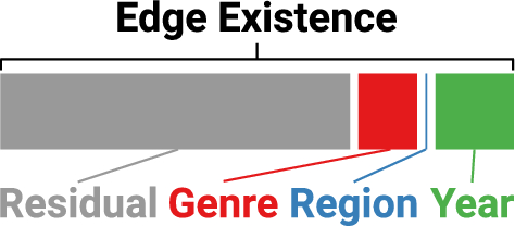
The relative importance of each explanatory variable to determine the existence of a link between two bands in the band projection
Once we establish that the existence of the connection is related to genre, temporal, and geographical similarity, we can ask the same question about the strength of the relationship between two bands. We apply the same model as before, changing the target variable:
Here, \(\log (W_{u,v})\) is the logarithm of the edge weight. Note that here we only focus on those edges that have a non-zero weight, i.e. those that exist. This is because we do not want this model to try and predict also edge existence, beside its strength, as we already took care of that problem with the previous model.
Table 7 contains the results in its second column. We can see that, also in this case, all three factors are significant predictors of the edge weights. The number of artists two bands share goes up if the two bands play similar genres, with temporal overlap, and if they originate from the same region. The \(R^2\) is noticeably lower, though, which means that \(\log (W_{u,v})\) is harder to predict than \(Y_{u,v}\) .
Figure 9 shows the same \(R^2\) decomposition we did in Fig. 8 for \(Y_{u,v}\) . All explanatory variables explain less variance than in the previous model. Relative to each other, the temporal overlap is the factor gaining more importance than genre similarity.
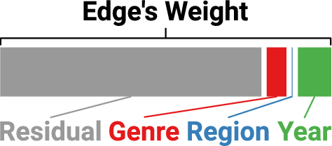
The relative importance of each explanatory variable to determine the weight of a link between two bands in the band projection
In this paper we have provided a showcase of the analyses and conclusions one could do in cultural data analytics by using node attribute analysis. We focused on the case study of Italian music from the past 120 years. We built a bipartite network connecting artists to bands and then projected it to analyze a band-band network. We have shown how one could identify genres concentrating in such a network, hinting at clusters of bands playing homogeneous genres, using network variance. We have shown a geographical analysis, calculating the network correlation between the region of origin of bands and the genres they play. We have shown how one could create a new music genre taxonomy by performing node attribute clustering on music genre data. We also proposed a novel way of performing era detection in a network, by finding clusters of similar consecutive years, where years are node attributes.
While we believe our analysis is insightful, there are a number of considerations that need to be made to contextualize our work. We can broadly categorize the limitations in two categories: the one relating to the domain of analysis, and the methodological ones.
When it comes to cultural data analytics, we acknowledge the fact that we are working with user-generated data. There is no guarantee that the data is free from significant mistakes, misleading entries, and incompleteness. Furthermore, our results might not be conclusive. We process data semi-automatically, and the coding process is not complete, meaning we miss a considerable amount of the lesser known artists. This also means that there could be biases in the data collection, induced by our decision on the order in which we explore the structure—which might be focusing too much or too little on specific areas of Italian music. As a specific example, in our project we have ignored another potentially rich source of node attributes: information about the music labels/publishers. This is available on Discogs, and we could envision a label to be represented as a node vector, whose entries are the number of records a specific label published for a specific band. We plan to use this information for future work. The coding process is still ongoing, and we expect to be able to complete the network in the near future.
On the methodlogical side, we point out that what we did is only possible in the presence of rich metadata—dozens if not hundreds of node attributes. Networks with scarce node attribute data would not be amenable to be analyzed with the techniques we propose here. However, in cultural data analytics, there is usually a high richness of metadata. Furthermore, many of the node attribute techniques only make sense if the node attributes are somehow correlated with the network structure. The musical genre clustering or the era detection would not produce meaningful results if the probability of two nodes of connecting was not influenced by their attributes—i.e. if the homophily hypothesis does not hold. In our case, the homophily assumption likely holds, as we show in Sect. Explaining the Network .
When considering some specific analyses we performed other limitations emerge. For instance, our era discovery approach exclusively looks at node activities. However, structural changes in the network’s connections also play a key role in determining discontinuities with the past (Berlingerio et al. 2013 ). We should explore in future work how to integrate our node attribute approach with structural methods. When it comes to the use of network variance, how to properly estimate its confidence intervals without using bootstrapping remains a future work. Therefore, the results we present here should be taken with caution, as it might be that some of the patterns we highlight are not statistically significant.
On a more practical side, our node attribute techniques hinge on specific matrix operations. While these can be efficiently computed on GPU using tensor representations, this might put a limit on the size of the networks analyzed, which have to fit in the GPU’s memory.
Availability of data and materials
All data and code necessary to replicate our results are available at http://www.michelecoscia.com/?page_id=2336 and Coscia ( 2024 ).
http://www.michelecoscia.com/?page_id=2336 .
https://it.wikipedia.org .
https://www.discogs.com/ .
Aggarwal CC (2018) Neural networks and deep learning. Springer 10(978):3
Google Scholar
Aljalbout E, Golkov V, Siddiqui Y, Strobel M, Cremers D (2018) Clustering with deep learning: taxonomy and new methods. arXiv preprint arXiv:1801.07648
Bail CA (2014) The cultural environment: measuring culture with big data. Theory Soc 43:465–482
Article Google Scholar
Baym NK, Ledbetter A (2009) Tunes that bind? predicting friendship strength in a music-based social network. Inf Commun Soc 12(3):408–427
Benson AR, Gleich DF, Leskovec J (2016) Higher-order organization of complex networks. Science 353(6295):163–166
Berlingerio M, Coscia M, Giannotti F, Monreale A, Pedreschi D (2013) Evolving networks: eras and turning points. Intell Data Anal 17(1):27–48
Bianchi FM, Grattarola D, Alippi C (2020) Spectral clustering with graph neural networks for graph pooling. In: International conference on machine learning, pp 874–883. PMLR
Bianconi G (2021) Higher-order networks. Cambridge University Press, Cambridge
Book Google Scholar
Bo D, Wang X, Shi C, Zhu M, Lu E, Cui P (2020) Structural deep clustering network. In: Proceedings of the web conference 2020, pp 1400–1410
Bretto A (2013) Hypergraph theory. An introduction. Mathematical Engineering. Springer, Cham 1
Bronstein MM, Bruna J, LeCun Y, Szlam A, Vandergheynst P (2017) Geometric deep learning: going beyond Euclidean data. IEEE Signal Process Mag 34(4):18–42
Brughmans T (2013) Thinking through networks: a review of formal network methods in archaeology. J Archaeol Method Theory 20:623–662
Candia C, Jara-Figueroa C, Rodriguez-Sickert C, Barabási A-L, Hidalgo CA (2019) The universal decay of collective memory and attention. Nat Hum Behav 3(1):82–91
Carletti T, Battiston F, Cencetti G, Fanelli D (2020) Random walks on hypergraphs. Phys Rev E 101(2):022308
Article MathSciNet Google Scholar
Cheng J, Wang Q, Tao Z, Xie D, Gao Q (2021) Multi-view attribute graph convolution networks for clustering. In: Proceedings of the twenty-ninth international conference on international joint conferences on artificial intelligence, pp 2973–2979
Coscia M Italian XX-XXI Century Music. https://doi.org/10.5281/zenodo.13309793
Coscia M (2020) Generalized euclidean measure to estimate network distances. Proc Int AAAI Conf Web Soc Media 14:119–129
Coscia M (2021) Pearson correlations on complex networks. J Complex Netw 9(6):036
Coscia M, Devriendt K (2024) Pearson correlations on networks: Corrigendum. arXiv preprint arXiv:2402.09489
Coscia M, Neffke FM (2017) Network backboning with noisy data. In: 2017 IEEE 33rd international conference on data engineering (ICDE), pp 425–436 . IEEE
Damstrup ASR, Madsen ST, Coscia M (2023) Revised learning via network-aware embeddings. arXiv preprint arXiv:2309.10408
Devriendt K, Martin-Gutierrez S, Lambiotte R (2022) Variance and covariance of distributions on graphs. SIAM Rev 64(2):343–359
Ezugwu AE, Ikotun AM, Oyelade OO, Abualigah L, Agushaka JO, Eke CI, Akinyelu AA (2022) A comprehensive survey of clustering algorithms: state-of-the-art machine learning applications, taxonomy, challenges, and future research prospects. Eng Appl Artif Intell 110:104743
Feldman BE (2005) Relative importance and value. Available at SSRN 2255827
Gleiser PM, Danon L (2003) Community structure in jazz. Adv Complex Syst 6(04):565–573
Grömping U (2007) Relative importance for linear regression in r: the package relaimpo. J Stat Softw 17:1–27
Hamilton W, Ying Z, Leskovec J (2017) Inductive representation learning on large graphs. Adv Neural Inf Process Syst 30
Hohmann M, Devriendt K, Coscia M (2023) Quantifying ideological polarization on a network using generalized Euclidean distance. Sci Adv 9(9):2044
Hristova S (2016) Images as data: cultural analytics and aby warburg’s mnemosyne. Int J Digital Art History (2)
Karjus A, Solà MC, Ohm T, Ahnert SE, Schich M (2023) Compression ensembles quantify aesthetic complexity and the evolution of visual art. EPJ Data Science 12(1):21
Kaufman T, Oppenheim I (2020) High order random walks: beyond spectral gap. Combinatorica 40:245–281
Lambiotte R, Rosvall M, Scholtes I (2019) From networks to optimal higher-order models of complex systems. Nat Phys 15(4):313–320
Lin Z, Kang Z, Zhang L, Tian L (2021) Multi-view attributed graph clustering. IEEE Trans knowl Data Eng
Mahalanobis P (1936) On the generalized distance in statistics. National Institute of Science of India
Manovich L (2020) Cultural analytics. MIT Press, Cambridge
McAndrew S, Everett M (2015) Music as collective invention: a social network analysis of composers. Cult Sociol 9(1):56–80
Mills BJ, Clark JJ, Peeples MA, Haas WR Jr, Roberts JM Jr, Hill JB, Huntley DL, Borck L, Breiger RL, Clauset A (2013) Transformation of social networks in the late pre-hispanic us southwest. Proc Natl Acad Sci 110(15):5785–5790
Moon S-I, Barnett GA, Lim YS (2010) The structure of international music flows using network analysis. New Media Soc 12(3):379–399
Newman ME (2001) Scientific collaboration networks. ii. Shortest paths, weighted networks, and centrality. Phys Rev E 64(1):016132
Pálovics R, Benczúr AA (2013) Temporal influence over the last. FM social network. In: Proceedings of the 2013 IEEE/ACM international conference on advances in social networks analysis and mining, pp 486–493
Pang G, Shen C, Cao L, Hengel AVD (2021) Deep learning for anomaly detection: a review. ACM Comput Surv (CSUR) 54(2):1–38
Park J, Celma O, Koppenberger M, Cano P, Buldú JM (2007) The social network of contemporary popular musicians. Int J Bifurc Chaos 17(07):2281–2288
Pennacchioli D, Rossetti G, Pappalardo L, Pedreschi D, Giannotti F, Coscia M (2013) The three dimensions of social prominence. In: International conference on social informatics, pp 319–332 . Springer
Perozzi B, Akoglu L, Iglesias Sánchez P, Müller E (2014) Focused clustering and outlier detection in large attributed graphs. In: Proceedings of the 20th ACM SIGKDD international conference on knowledge discovery and data mining, pp 1346–1355
Perozzi B, Al-Rfou R, Skiena S (2014) Deepwalk: online learning of social representations. In: Proceedings of the 20th ACM SIGKDD international conference on knowledge discovery and data mining, pp 701–710
Ronen S, Gonçalves B, Hu KZ, Vespignani A, Pinker S, Hidalgo CA (2014) Links that speak: the global language network and its association with global fame. Proc Natl Acad Sci 111(52):5616–5622
Salah AA, Manovich L, Salah AA, Chow J (2013) Combining cultural analytics and networks analysis: Studying a social network site with user-generated content. J Broadcast Electron Media 57(3):409–426
Scarselli F, Gori M, Tsoi AC, Hagenbuchner M, Monfardini G (2008) The graph neural network model. IEEE Trans Neural Netw 20(1):61–80
Schich M, Hidalgo C, Lehmann S, Park J (2008) The network of subject co-popularity in classical archaeology
Stebbins RA (2004) Music among friends: the social networks of amateur musicians’. Popular music: critical concepts in media and cultural studies 1:227–245
Teitelbaum T, Balenzuela P, Cano P, Buldú JM (2008) Community structures and role detection in music networks. Chaos Interdiscipl J Nonlinear Sci 18(4)
Tsitsulin A, Palowitch J, Perozzi B, Müller E (2020) Graph clustering with graph neural networks. arXiv preprint arXiv:2006.16904
Vlegels J, Lievens J (2017) Music classification, genres, and taste patterns: a ground-up network analysis on the clustering of artist preferences. Poetics 60:76–89
Wang C, Pan S, Hu R, Long G, Jiang J, Zhang C (2019) Attributed graph clustering: a deep attentional embedding approach. arXiv preprint arXiv:1906.06532
Wu L, Cui P, Pei J, Zhao L, Guo X (2022) Graph neural networks: foundation, frontiers and applications. In: Proceedings of the 28th ACM SIGKDD conference on knowledge discovery and data mining, pp 4840–4841
Xie J, Girshick R, Farhadi A (2016) Unsupervised deep embedding for clustering analysis. In: International Conference on Machine Learning, pp. 478–487 . PMLR
Xu J, Wickramarathne TL, Chawla NV (2016) Representing higher-order dependencies in networks. Sci Adv 2(5):1600028
Yang S, Verma S, Cai B, Jiang J, Yu K, Chen F, Yu S (2023) Variational co-embedding learning for attributed network clustering. Knowl-Based Syst 270:110530
Yildirim MA, Coscia M (2014) Using random walks to generate associations between objects. PLoS ONE 9(8):104813
Zhang C, Song D, Huang C, Swami A, Chawla NV (2019) Heterogeneous graph neural network. In: Proceedings of the 25th ACM SIGKDD international conference on knowledge discovery & data mining, pp 793–803
Zhou T, Ren J, Medo M, Zhang Y-C (2007) Bipartite network projection and personal recommendation. Phys Rev E 76(4):046115
Zhou J, Cui G, Hu S, Zhang Z, Yang C, Liu Z, Wang L, Li C, Sun M (2020) Graph neural networks: a review of methods and applications. AI Open 1:57–81
Zhou K, Huang X, Li Y, Zha D, Chen R, Hu X (2020) Towards deeper graph neural networks with differentiable group normalization. Adv Neural Inf Process Syst 33:4917–4928
Download references
Acknowledgements
The author is thankful to Amy Ruskin for the project’s idea, and to Seth Pate and Clara Vandeweerdt for insightful discussions.
Author information
Authors and affiliations.
CS Department, IT University of Copenhagen, Copenhagen, Denmark
Michele Coscia
You can also search for this author in PubMed Google Scholar
Contributions
M.C. designed and performed all experiments, prepared figures, and wrote and approved the manuscript.
Corresponding author
Correspondence to Michele Coscia .
Ethics declarations
Competing interests.
The authors declare that they have no competing interest.
Additional information
Publisher's note.
Springer Nature remains neutral with regard to jurisdictional claims in published maps and institutional affiliations.
Supplementary information
Supplementary material 1., rights and permissions.
Open Access This article is licensed under a Creative Commons Attribution-NonCommercial-NoDerivatives 4.0 International License, which permits any non-commercial use, sharing, distribution and reproduction in any medium or format, as long as you give appropriate credit to the original author(s) and the source, provide a link to the Creative Commons licence, and indicate if you modified the licensed material. You do not have permission under this licence to share adapted material derived from this article or parts of it. The images or other third party material in this article are included in the article’s Creative Commons licence, unless indicated otherwise in a credit line to the material. If material is not included in the article’s Creative Commons licence and your intended use is not permitted by statutory regulation or exceeds the permitted use, you will need to obtain permission directly from the copyright holder. To view a copy of this licence, visit http://creativecommons.org/licenses/by-nc-nd/4.0/ .
Reprints and permissions
About this article
Cite this article.
Coscia, M. Node attribute analysis for cultural data analytics: a case study on Italian XX–XXI century music. Appl Netw Sci 9 , 56 (2024). https://doi.org/10.1007/s41109-024-00669-5
Download citation
Received : 17 May 2024
Accepted : 27 August 2024
Published : 05 September 2024
DOI : https://doi.org/10.1007/s41109-024-00669-5
Share this article
Anyone you share the following link with will be able to read this content:
Sorry, a shareable link is not currently available for this article.
Provided by the Springer Nature SharedIt content-sharing initiative
- Cultural data analytics
- Complex networks
- Data clustering
- Temporal analysis

IMAGES
VIDEO
COMMENTS
RPubs - Case Study: Exploratory Data Analysis in R. R Pubs. by RStudio. Sign in Register. Case Study: Exploratory Data Analysis in R. by Daniel Pinedo. Last updated over 3 years ago.
Here, I will be using R programming language for this analysis because of its potential benefits to reproducibility, transparency, easy statistical analysis tools and data visualizations. The following sets of data analysis process will be followed: Ask, Prepare, Process, Analyze, Share, Act. The case study road map as listed below will be ...
The power of R through their packages Purrr, broom, dplyr, and ggplot2 to manipulate data frames and tidy tables becomes a reality in this course. The power to convert several columns (variables) into a nested dataframe for each row of the objects under analysis plus the map function to apply different transformations and functions in a couple ...
Der Beitrag A Data Science Case Study in R erschien zuerst auf Statistik Service. Demanding data science projects are becoming more and more relevant, and the conventional evaluation procedures are often no longer sufficient. For this reason, there is a growing need for tailor-made solutions, which are individually tailored to the project's ...
Modern data science is a team sport. To be able to fully engage, analysts must be able to pose a question, seek out data to address it, ingest this into a computing environment, model and explore, then communicate results. This is an iterative process that requires a blend of statistics and computing skills.
Grouping and summarizing. Summarizing the full dataset. In this analysis, you're going to focus on "% of votes that are yes" as a metric for the "agreeableness" of countries. You'll start by finding this summary for the entire dataset: the fraction of all votes in their history that were "yes". Note that within your call to ...
Using the Case Study Roadmap as a guide, this analysis will follow the steps of the data analysis process: Ask, Prepare, Process, Analyze, Share, and Act. Step 1: Ask Analyze the smart device usage data in order to gain insight into how consumers use non-Bellabeat smart devices and select one Bellabeat product to apply these insights to my ...
Data Analysis Case Study codebase for R, Python and Stata. R, Python and Stata code for Data Analysis for Business, Economics, and Policy by Gábor Békés (CEU) and Gábor Kézdi (U. Michigan) Published on 6 May 2021 by Cambridge University Press gabors-data-analysis.com. How to use.
0%. 0%. Edmundo M. 7 months. This course in EDA with R gives you the fundamentals on statistics measures of center and variability, as well as to how discern the shape of a distribution and determine whether it is a skew distribution. The set of data provided to look and explore the effects of scale transformation on the shape of a distribution ...
Exploratory Data Analysis in R: Case Study features 58 interactive exercises that combine high-quality video, in-browser coding, and gamification for an engaging learning experience that will immerse you in Exploratory Data Analysis. What you'll learn
Google Data Analytics Capstone: Case Study 1 (Using RStudio & Tableau) This article depicts the logical frames I proposed for this case study, the data analysis tool I used, the analysing train of ...
Course Description. In this course, you will strengthen your knowledge of time series topics through interactive exercises and interesting datasets. You'll explore a variety of datasets about Boston, including data on flights, weather, economic trends, and local sports teams. For Business.
Data Analysis with R Programming Course by Google
Bellabeat Case Study with R
Data analysis using R. Last Updated : 04 Sep, 2024. Data Analysis is a subset of data analytics, it is a process where the objective has to be made clear, collect the relevant data, preprocess the data, perform analysis (understand the data, explore insights), and then visualize it. The last step visualization is important to make people ...
To answer the key business questions, you will follow the steps of the data analysis process: ask, prepare, process, analyze, share, and act. The tools used throughout the project: R studio. R ...
In case you require additional background on these topics, I recommend checking out the tutorials listed at the end of this article on the prior-mentioned topics. Step 1: Save the data to a file (excel or CSV file) and read it into R memory for analysis. This step is completed by following the steps below. 1. Save the CSV file locally on ...
A SAS-to-R success story. Our biostatistics group has historically utilized SAS for data management and analytics for biomedical research studies, with R only used occasionally for new methods or data visualization. Several years ago and with the encouragement of leadership, we initiated a movement to increase our usage of R significantly.
R Pubs. by RStudio. Sign in Register. Exploratory Data Analysis in R: Case Study. by william surles. Last updated about 7 years ago.
4 Data Analytics in R: A Case Study Bas ed Approach 1.2.2 Techniques for Handling Missing Data First method is deleting the mis sing records, in the case if the variable is havin g missing values
R is built by statisticians and leans heavily into statistical models and specialized analytics. Data scientists use R for deep statistical analysis, supported by just a few lines of code and ...
Data analyst interview - case study. So i have an interview in twe weeks for this job that i am very interested on "data analyst" and i was told to come up with any personal project to present during the interview. Anyone have any idea or video that i can watch and practice a project as simple as possible.
Here are five must-know R packages for data analysis in R. 1. dplyr Dplyr is part of the tidyverse collection of packages designed for effective data manipulation. It provides intuitive functions to make working with data easier. These include filter to select rows from a dataset that meet certain conditions, mutate to create new columns, arrange to sort data, and summarize to create summary ...
Page 2 Kaplan Business School Assessment Outline Assessment Description For this assessment, you are required to create a case study that utilises R language to perform basic statistical analysis on a publicly available dataset as described in the case study below. Case Study: Step 1: Dataset Selection: Choose a suitable dataset from publicly available datasets commonly used with R.
Then learn how to create compelling visualizations with Python and R, including basic plotting, advanced graphs, and animated plots. Introduction to AI. We will introduce you to artificial intelligence concepts, process geospatial data, and deep into deep learning with both Python and R. And case studies. Apply your knowledge to real-world ...
Welcome to the Bellabeat data analysis case study! In this case study, you will perform many real-world tasks of a junior data analyst. You will imagine you are working for Bellabeat, a high-tech manufacturer of health-focused products for women, and meet different characters and team members. In order to answer the key business questions, you ...
Through the parameterization of structural data and algorithm development, the framework identifies and examines key facade features. A case study in Tehran applies this method by conducting visual analysis to understand facade elements and retrieving parametric data through computational reasoning.
DATA ANALYSIS: We utilized the R statistical software (V.4.3.1; R package meta) to conduct the analysis of all the data obtained. We calculated the OR for binary variables, and the corresponding 95% CI. To synthesize the data, random-effect models, as well as forest plots were generated to visually represent the synthesis of the data.
In this paper we have provided a showcase of the analyses and conclusions one could do in cultural data analytics by using node attribute analysis. We focused on the case study of Italian music from the past 120 years. We built a bipartite network connecting artists to bands and then projected it to analyze a band-band network.
Data analysis. For the qualitative study (stage 1), focus groups were carried out that, through content analysis, made it possible to recognize the most relevant competencies from the perspective of the participants. ... Stage 2: quantitative analysis of the influence of generic competencies on the development of specific competencies: case ...